Although we regularly use and rely on numbers, human beings are simply not very good at understanding them. Most of us can effortlessly feel the shading of a spoken word. But present us with big numbers, or probabilities, and we have no idea how to put them into context, or properly understand their scale or likelihood.
The pandemic has only underlined this mental deficiency. How can we comprehend the death toll, or the risk factors, in purely mathematical terms?
In the field of data visualization, there has been a movement to make numbers more vivid, and their scale more comprehensible, through physical representations. The sea of empty chairs, for instance, shows us, rather than tells us, about all of those who have died from Covid.
Recently there was a conversation at Northeastern University on “The Physical Life of Data,” moderated by Dietmar Offenhuber, whose own work translates the physical into data, as in his exploration of the circulation of trash. The conversation had some great examples of the effective — and affective — representation of data in the real world, and how to take advantage of more visceral sensory responses, rather than abstract mental models, to understand the import of numbers.
For the Perpetual Plastic project, 50 volunteers collected plastic debris along Bali’s west coast and sorted the waste into different colors. Then an information design team, Liina Klauss, Skye Morét, and Moritz Stefaner, shaped the collection into a potent visualization of where the 8.3 billion metric tons of plastic that have been produced since the 1950s have gone.


(Bonus points for the interplay with Robert Smithson’s Spiral Jetty.)
Dan Lockton’s Powerchord is “a platform for experimenting with energy sonification.” With appliances routed through the device, it makes the abstract data of how much electricity is being used obvious to the ears.https://player.vimeo.com/video/105917275
One peril with projects like these is that they are so well done that the visualizations (or sonifications) end up being attractive rather than unsettling or instructive. I actually kind of like this “Sound of the Office”?
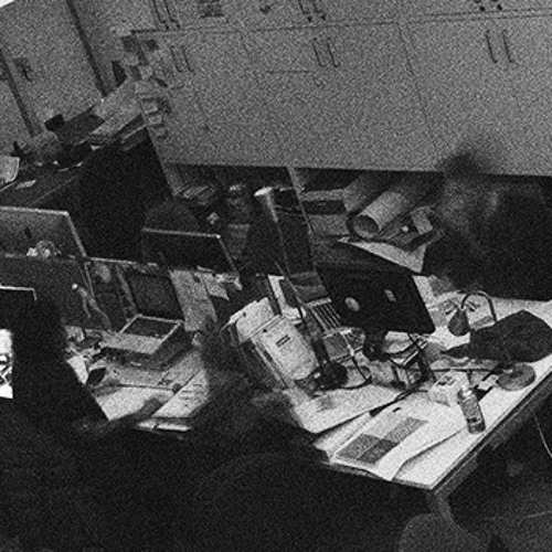
Sound of the office by Dan Lockton | Free Listening on SoundCloud
Electricity data from three CurrentCost appliance monitors – kettle, laser printer and a row of desks – for twelve hours, turned into audio using CSVMIDI http://www.fourmilab.ch/webtools/midicsv/ and
Open Syllabus, a vast expansion of some coding I did ages ago to aggregate syllabi from the web (I am now on OS’s board), has released an updated visualization of a million books and how frequently they are assigned together in a course. This analysis ends up producing a marvelous, incredibly detailed galaxy of topics and their adjacencies and connections.


Be sure to zoom in; this is a gigapixel knowledge map.
Another addition to Humane Ingenuity‘s growing catalog of serendipity tools, launched in the last issue of HI:
Tim Sherratt’s GLAM Workbench has a tool to “Select a random(ish) record from DigitalNZ“—that is, to pull a random photo, or work of art, or newspaper page from over 30 million items in New Zealand’s combined library and museum collections.
Julia Cambre‘s Morbid Methods lets you write an obituary, eulogy, or postmortem report for your expired digital device, and then creates an appropriately somber web page in its memory.


I look forward to writing the obit for the aging laptop I’m writing this newsletter on. Likely cause of death: overheating from Zoom meetings.