Tucked away in a presentation on the HathiTrust Digital Library are some fascinating visualizations of libraries by John Wilkin, the Executive Director of HathiTrust and an Associate University Librarian at the University of Michigan. Although I’ve been following the progress of HathiTrust closely, I missed these charts, and I want to highlight them as a novel method for revealing a library fingerprint or signature using shared metadata.
With access to the catalogs of HathiTrust member libraries, Wilkin ran some comparisons of book holdings. His ingenious idea was not only to count how many libraries held each particular work, but to create a visualization of each member library based on how widely each book in its collection is held by other libraries.
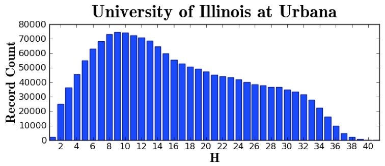
In Wilkin’s graphs for each library, the X axis is the number of libraries containing a book (including the library the visualization represents), and the Y axis is the number of books. That is, it contains columns of books from 1 (the member library is the only one with a particular book) to 41 (every library in HathiTrust has a physical copy of a book). Let’s look at an example:
Reading the chart from left to right, the University of Illinois at Urbana-Champaign library has a small number of books that it alone holds (~1,000), around 25,000 that only one other library has (the “2” column), 36,000 that two other libraries have, etc.
What’s fascinating is that the overall curvature of a graph tells us a great deal about a particular library.
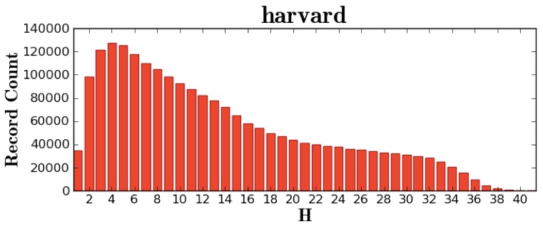
There are three basic types of libraries we can speak of using this visualization technique. First, there are left-leaning libraries, which have a high number of books that do not exist in many other libraries. These libraries have spent considerable effort and resources acquiring rare volumes. For example, Harvard, which has hundreds of thousands of books that only a handful of other libraries also have:
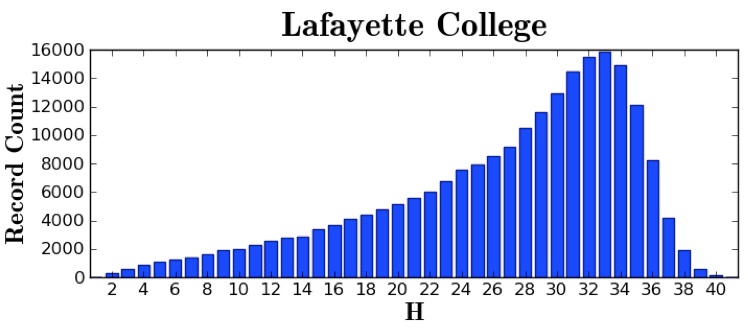
On the other side, there are right-leaning libraries, which consist mostly of books that are nearly universally held by other libraries. These libraries generally carry only the most circulated volumes, books that are expected to be found in any academic research library. For instance, Lafayette College:
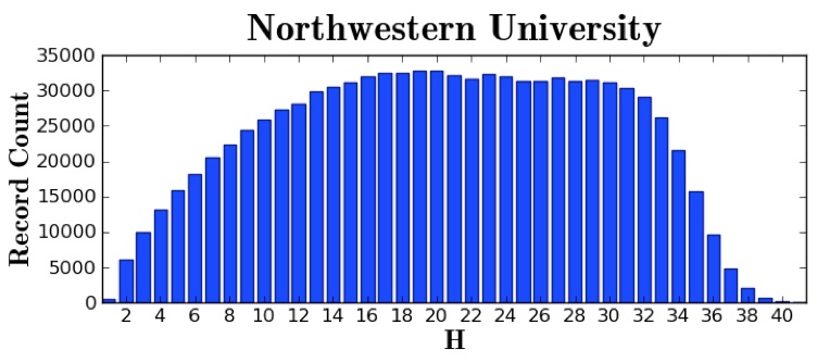
Finally, there are rounded libraries, which don’t have many popular books or many rare books, but mostly works that an average number of similar libraries have. These libraries roughly echo their cohort (in this case, large university research libraries in the United States). They could be called—my apologies—well-rounded in their collecting, likely acquiring many scholarly monographs while still remaining selective rather than comprehensive. For instance, Northwestern University:
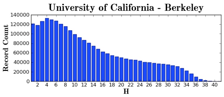
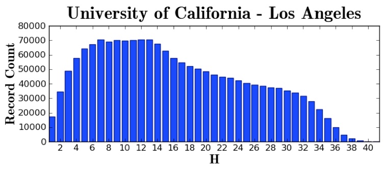
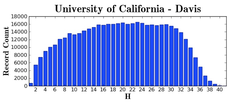
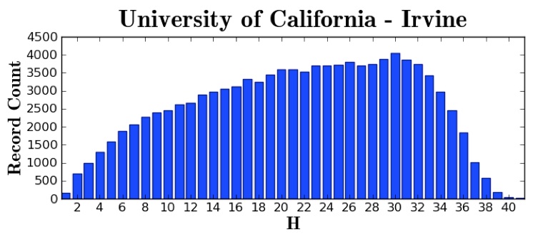
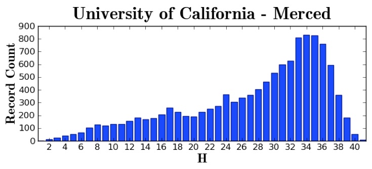
Of course, the library curve is often highly correlated with the host institution’s age, since older universities are more likely to have rare old books or unusual (e.g., local or regional) books. This correlation is apparent in this sequence of graphs of the University of California schools, from oldest to newest:
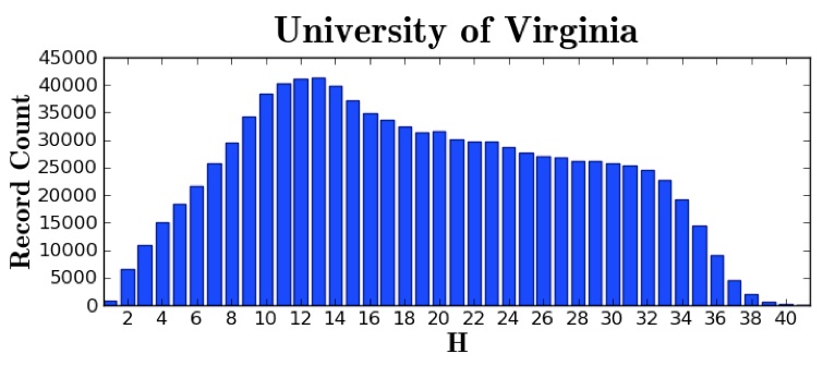
Beyond the three basic types, there are interesting anomalies as well. The University of Virginia is, unsurprisingly, a left-leaning library, but not quite as a left-leaning as I would have expected:
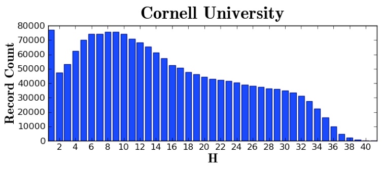
Cornell is also left-leaning, but also clearly has a large, idiosyncratic collection containing works that no other library has—note the spike at position “1”:
Moreover, one could imagine using Wilkin Graphs (I’m going to go ahead and name it that to give John full credit) to analyze the relative composition of other kinds of libraries. For instance, LibraryThing has a project called Legacy Libraries, containing the records of personal libraries of famous historical figures such as Thomas Jefferson. A researcher could create Wilkin Graphs for Jefferson and other American founders (in relation to each other), or among intellectuals from the Enlightenment.
Update: Sherman Dorn suggests Wilkin Profile rather than Wilkin Graph. Sure, rolls off the tongue better: Prospective college student on a campus visit asks the tour guide, “So what’s your library’s Wilkin Profile?” According to Constance Malpas, OCLC has created such profiles for 160 libraries. These graphs can be created with the Worldcat Collection Analysis service (which, alas, is not openly available).
Clarification: John Wilkin comments below that the reason for the spike in position 1 in the Cornell Wilkin Profile is that Cornell had a digitization program that added many unique materials to HathiTrust. This made me realize, with some help from Stanford Library’s Chris Bourg and Penn State’s Mike Furlough that the numbers here are only for the shared HathiTrust collection (although that collection is very large—millions of items). Nevertheless, the general profile shapes should hold for more comprehensive datasets, although likely with occasional left and right shifts for certain libraries depending on additional unique book collections that have not been digitized. (That may explain the University of Virginia Wilkin Profile.) Note also that Google influenced the numbers here, since many of the scanned books come from the Google Books (née Google Library) project, introducing some selection bias which is only now being corrected—or worsened?—by individual institutional digitization initiatives, like Cornell’s.
Leave a Reply
You must be logged in to post a comment.