Although we regularly use and rely on numbers, human beings are simply not very good at understanding them. Most of us can effortlessly feel the shading of a spoken word. But present us with big numbers, or probabilities, and we have no idea how to put them into context, or properly understand their scale or likelihood.
The pandemic has only underlined this mental deficiency. How can we comprehend the death toll, or the risk factors, in purely mathematical terms?
In the field of data visualization, there has been a movement to make numbers more vivid, and their scale more comprehensible, through physical representations. The sea of empty chairs, for instance, shows us, rather than tells us, about all of those who have died from Covid.
Recently there was a conversation at Northeastern University on “The Physical Life of Data,” moderated by Dietmar Offenhuber, whose own work translates the physical into data, as in his exploration of the circulation of trash. The conversation had some great examples of the effective — and affective — representation of data in the real world, and how to take advantage of more visceral sensory responses, rather than abstract mental models, to understand the import of numbers.
For the Perpetual Plastic project, 50 volunteers collected plastic debris along Bali’s west coast and sorted the waste into different colors. Then an information design team, Liina Klauss, Skye Morét, and Moritz Stefaner, shaped the collection into a potent visualization of where the 8.3 billion metric tons of plastic that have been produced since the 1950s have gone.
(Bonus points for the interplay with Robert Smithson’s Spiral Jetty.)
Dan Lockton’s Powerchord is “a platform for experimenting with energy sonification.” With appliances routed through the device, it makes the abstract data of how much electricity is being used obvious to the ears.https://player.vimeo.com/video/105917275
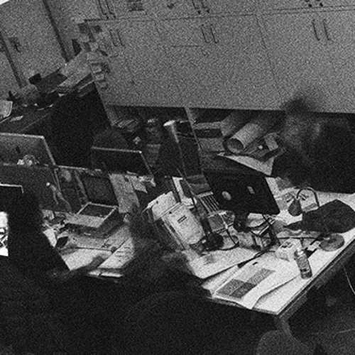
One peril with projects like these is that they are so well done that the visualizations (or sonifications) end up being attractive rather than unsettling or instructive. I actually kind of like this “Sound of the Office”?
Sound of the office by Dan Lockton | Free Listening on SoundCloud
Electricity data from three CurrentCost appliance monitors – kettle, laser printer and a row of desks – for twelve hours, turned into audio using CSVMIDI http://www.fourmilab.ch/webtools/midicsv/ and
Open Syllabus, a vast expansion of some coding I did ages ago to aggregate syllabi from the web (I am now on OS’s board), has released an updated visualization of a million books and how frequently they are assigned together in a course. This analysis ends up producing a marvelous, incredibly detailed galaxy of topics and their adjacencies and connections.
Be sure to zoom in; this is a gigapixel knowledge map.
Another addition to Humane Ingenuity‘s growing catalog of serendipity tools, launched in the last issue of HI:
A visualization of the colors of the objects in our lives over the last two centuries:
Cath Sleeman took the digitized images of household and commercial artifacts in the Science Museum (UK) and distilled them down to the colors of their pixels. This process ended up documenting the loss of colorful items around home and work spaces, in favor of objects covered in more drab shades of black and white. Spunky colors like red and yellow, once very prevalent among objects of the Victorian era, have been nearly pinched out of existence. On the positive side for those who enjoy more expressive colors, purple and blue, once rare, have made some progress in material culture since 1960s, and especially since around 1980. (Hypothesis: Prince.)
As Sleeman notes, the shift in the palette we see in our artificial environments is due in large part to the rise of plastic, and the related decline of wood, leather, and other natural materials. But there are also aesthetic choices at work. For instance, phones used to come in colors other than black and white:
(This child of the 1970s can testify: that shade of green was very common, as was that orange.)
This technique could be extended, with results that would be equally interesting, in other areas. For instance, you could create a color timeline of our clothing using the digitized images of fashion across the centuries.
The Science Museum has engaged in a number of fascinating experiments recently using the collection they have digitized over the last few years. I briefly highlighted another one of these experiments on social media last week, and an extremely large audience ended up engaging with it. It is worth understanding why the post I will mention shortly went viral, as I think it says something about how we have lost our way on the internet because of social media.
I will not recount here the many ways in which Facebook and Twitter and their ilk damage discourse, fracture society, etc.; newspapers are filled with the evidence, and op-ed pages jeremiads. Instead, I want to revisit what made us like the internet before it became synonymous with these large social networks.
The first decade of the web, in the 1990s, was filled with strange encounters and serendipity. Yahoo! was a ridiculously named web directory (the exclamation point was the cherry on top of the ridiculous sundae), but it also, in a perhaps cloyingly jocular way, expressed fairly well the feeling of diving into the young internet, which was then a random sea of the unexpected. Yahoo!’s founding metaphor, in addition to this diving, was fishing, suddenly catching something new or helpful by clicking on a link, and the delight that engendered. Witness Yahoo!’s initial TV ad:
In the same vein, there used to be a popular service called StumbleUpon, which took you on a whim to the distant corners of the internet.
The RSS feed, gloriously unencumbered by algorithmic interference and now lamented in its dormancy, was also an engine of serendipity. Yes, subscribing to hundreds of RSS feeds meant that your Google Reader was often filled with irrelevant or boring things. But it also frequently rewarded you with that occasional gem of writing or thought, or an introduction to a topic unfamiliar to you, all without some computer math to guide your eyeballs to the same video clip everyone else is currently watching.
We all know what happened. Really, it is not that complicated. In the ad-fueled rush to provide you with More of the Same, and Views That Match Your Own, social media pinched the oddball reds and yellows out of our digital environment, and filled it with an oppressive expanse of blacks and whites. Is that what you originally logged on for?
Which is why the Science Museum’s experiment “Never Been Seen” is so interesting — and the reaction to it in many ways reaffirming of the internet past, without seeming nostalgic. Never Been Seen simply took a list of objects that the museum had digitized and put on the web, but had zero page views, and served them up, one at a time, to individual virtual visitors. Obviously, the objects had been seen by museum curators and other staff, and probably some researchers too, so the name of the service was imperfect, but the effect was electrifying for many web surfers now unconsciously used to the herding of social media.
I wrote a short post about Never Been Seen on my personal social media site (social.dancohen.org, which is powered by the great Micro.blog, go get yourself an account right now), and from there it propagated its way to other places. On Twitter, the post went viral and from what I can tell, about 50,000 people clicked through to Never Been Seen and were served an awaiting object by the Science Museum. People loved it.
The positive reactions to these serendipitous encounters should tell us something, as should the psychological framing and clever coding by the museum’s digital team. Visitors to Never Been Seen are first shown a highly pixelated version of the object, which maximizes the anticipation. And then, since the museum has such a broad and often bizarre collection of items — including a significant number of icky old medical implements as well as duds like rocks and bricks — there was a Monty Hallesque reveal. Behind the curtain could be a new car, or a goat! Some people were thrilled and some were disgusted and some were confused. Many were curious to learn more, and read on about the object. A remarkable number of visitors thought the item they got was perfect for them — the museum, magically, had an uncanny understanding of what they might like to see.
In short, this reminds us that despite two decades of social media suppression, there’s still a latent, and currently unsatisfied, yearning for the truly surprising, unusual, and unique.
So let us find new ways to encounter new things, maybe things that are just for us and not for our friends too or peer groups or whole social networks. Not What You Were Looking For things. Sometimes we need to be caught off-guard, not by some algorithmically blessed engagement sparkle, but by something richer and out of the blue. And we cannot fully anticipate what we will find thrilling, and neither can the machines.
A catalog of such magical services would be helpful. I’ll start.
Text “A work of art just for me, please!” to (+1) 773-249-6838.
(No kidding, I received a painting by a Cohen, no relation)
That is a generous little text bot from Anule Ndukwu that will send you a random piece of art from the Art Institute of Chicago. As she writes, it was “Inspired by Covid-19 museum-trip nostalgia, and many afternoons playing hooky in the modern wing.” Yes!
I would love to hear from HIers about other examples of this serendipitous matching, and will include them in a future issue.
(Related: Read Nikhil Trivedi’s announcement of the Art Institute of Chicago’s new API, and its many possibilities, from earlier this week.)
Lorie Emerson and her Media Archeology Lab have been experimenting with slowing things down over the last few months. For instance, as part of a series on “slow networks,” they have tried to recreate Zoom using 300 baud modems and 1990s tech. The results are an alternate timeline of tech, bordering on steampunk, but with devices from a much more recent era:
Procedure: We ran the built-in 12V/2.5 amp/RJ-11 combination power and transmission cord from the Mitsubishi Visitel to the wall outlet and to the input jack on the Panasonic Videophone. We then ran a 13.5 V/2.5 amp power supply from the Panasonic to the wall outlet. We connected a second RJ-11 cord from the output jack on the Panasonic to the input jack on the Mitsubishi. We then sent images of ourselves back and forth between the Panasonic and the Mitsubishi videophones. Both automatically saves images so we scrolled through and pressed the reset button to clear the memory. We noted that the Mitsubishi has a smaller memory that allowed us to save about 5 images. The Panasonic allowed us to save about 12 images.
A follow-up from HI32, courtesy of HIer Emery Marc Petchauer: If you liked wandering virtually through the Yorkshire woods with audio from the British Library, you might also like Sounds of the Forest:
We are collecting the sounds of woodlands and forests from all around the world, creating a growing soundmap bringing together aural tones and textures from the world’s woodlands.
Peaceful.
The audience for this newsletter has grown recently thanks to my friend Alan Jacobs, who very generously included it on his list of newsletters that he enjoys. Let me return the favor and recommend Alan’s newsletter, Snakes & Ladders, which is always filled with the unexpected and delightful, and is good companion reading to Humane Ingenuity. You should also read Alan’s books, which are incredibly thoughtful guides to engaging with literature, ideas, faith, and (perhaps most challengingly) other people.
And finally, let me also recommend Seb Chan’s newsletter, Fresh and New, in which I discovered Never Been Seen.
If for some reason you could use some relaxation right now, I recommend heading over to Faint Signals, an interactive work of art that was one of the clever entries in the annual competition run by the British Library Labs for creative reuses of their collection.
Faint Signals generates an imagined Yorkshire forest, which you can then explore through the seasons. As you meander through the digital woods, peaceful natural sounds from the British Library’s extensive audio collection—birds, rain, wind—are encountered. Faint Signals doesn’t exactly rival the real signals of the real thing, but HIers, it’s winter, and there’s a pandemic still going on. So put your headphones on, turn your phone off, and take a leisurely stroll through the virtual forest.
OpenAI has released CLIP, the Contrastive Language–Image Pre-training tool, which connects some of their work on natural language supervision (see prior HIs on GPT-2 and GPT-3) with image analysis, forging associations between the textual and the visual.
Travis Hoppe used CLIP on some famous poems and an open access collection of landscape photos. The results are often uncanny, finding strikingly appropriate nature photographs for each line of poetry:
Where Alph, the sacred river, ran through caverns measureless to man Down to a sunless sea.
And on the pedestal, these words appear: My name is Ozymandias, King of Kings.
’Twas brillig, and the slithy toves Did gyre and gimble in the wabe: All mimsy were the borogoves, And the mome raths outgrabe.
Because I could not stop for Death – He kindly stopped for me – The Carriage held but just Ourselves – And Immortality.
Melissa Terras and David Beavan createdWindsor-o-Tron, which can generate (using GPT-2 and and a data set of old speeches) as many Christmas addresses as the Queen might need:
Our lives are shaped by our past, and as we live out our future together we should know each other best. It is difficult for us to know far into the future as our families gather round us, but it is better that we have some sense than that we have any sense at all. I wish you all, together with your children and grandchildren, a blessed Christmas.
(Also of note: Europeana has a call out for the assembly of new cultural heritage data sets for AI tools to train on. Keeping on eye on that.)
Readers of Humane Ingenuity know that I care a lot about the preservation of, and access to, a wide array of human expression. From my notepad, here is a bit of my running list of what we will have, and have not, from the past few weeks:
We will have digital facsimiles of books, and pure, reflowing ebooks, from works that were published in 1925, but potentially not from works that were published in 2020, because of copyright law, digital rights management/encryption, and the ebook market that libraries currently face, in which they often rent rather than buy.
We may have the contents of an entire social network frequented by a large number of unethical people, but only because a hacker took action before it was offlined by Amazon Web Services. And if it survives, it will be in the dark corners of hidden storage systems, not in a preservation institution and widely available to future researchers. (This may be ok with many of you, and maybe with me too; my notepad makes no judgments.)
We will likely lose access to most of a much larger and older social network, because the official archiving of that network ended on December 31, 2017. Ethical archivists have found ways to save the IDs for messages from that network since 2017, but these “dehydrated” formats, while laudably giving agency to the creators of those messages rather than just rashly grabbing everything, also makes future retrieval (“rehydration”) iffy. (This may also be ok; the notepad has no comment.)
As part of my effort to notice more around me during the pandemic, I took an interest in a mysterious building not so far from where I live.
Behind a row of shops that used to contain a Sushi counter, a jewelry store, and juice bar — all now permanently closed due to Covid — sits a converted garage, constructed from cinder blocks. It abuts the train tracks.
Aside from a small window in the single door, there are two large windows, but they are on the upper floor, and the blinds are often drawn. Two green plastic chairs sit outside, empty.
Most intriguingly, above the door is a blue sign with one word: KIMAT. And a symbol that looks like the cross-section of a wood-framed shelter.
During 2020, my interest became obsession. What was KIMAT? What did the symbol mean? The only signage other than “KIMAT” was small note card taped to the door that read: “VISITORS PLEASE Call”. Call for what?
Finally, rather hesitantly, I casually drifted from my morning walk to look as inconspicuously as possible through the door. The place was filled with unusual tools and materials of all shapes and sizes, in a two-story tall industrial lab: giant band saws, electronic devices that were hard to identify or date, a large pulley system with a chain that could be described, accurately, as medieval. Wood, metal, and plastic sheets leaning everywhere. It was mostly dark inside.
Now I was even more curious.
Then, one early winter morning, an elderly man appeared, sitting in one of the green chairs. He was getting some fresh air, or maybe thinking, or probably both. He seemed relaxed. So I asked him about KIMAT.
His name is Dae Kim. He is in his eighties, and he is an inventor. For many years he worked at the Esso Research and Engineering Co., a kind of Bell Labs for the giant oil corporation, filled with PhDs like him. He is best known for his Synchro-Thermal Reactor System, which could clean the emissions of dirty cars by 92%.
When he was 68, Dae retired, with many patents to his name. But he kept tinkering and inventing in his spare time, and hoped to one day launch an “International Institute for Independent Inventors.” He also saw that the global problems he wanted to solve as a young engineer had only gotten worse, especially climate change. He resolved to do something about it.
So when Dae turned 80, he bought some old, used equipment and opened KIMAT LAB in the modest structure sandwiched between the tracks and the shops. He found himself reinvigorated. He came up with new techniques for storing paint in bags rather than cans, and applying it to surfaces using a novel spraying method, which would greatly reduce chemical waste. He is working on inventions for addressing other forms of pollution, and new ways to heat and cool that are much more efficient than current technology. Dae Kim has a lot to do, and a place to do it. There’s no time like the present.
A few weeks after I spoke to Dae, KIMAT was dark and the curtains were drawn again. The chairs were empty. I was worried.
But then a new sign appeared in the window:
An idea for a digital work of art, an adaptive painting, from J.C.R. Licklider 50 years ago in Computers and Their Potential Applications in Museums:
When an underchallenging painting or a print is first hung on the living room wall, everyone in the family looks at it. It attracts repeated examination and figures in conversation for several days or weeks, but then it gradually fades into the wall until it is actually seen, actually perceived, only when it is called to attention by an unsatiated visitor or by some topical coincidence. Over-challenging paintings are rarely hung on living room walls.
An adaptive painting would change a little each time you examined it. It might be programmed to grow more complex in structure. It might be programmed to grow more abstract. Imagine, for example, a “Mont Sainte-Victoire” programmed to recapitulate in a month or a year Cezanne’s long development of understanding and the progressively increasing abstraction of his conception of his most enduring model. I think that such a painting would hold its interest – indeed that it would motivate a strong involvement on the part of each member of the family in a germinal episode of the history of art.
A scene that changes subtly, but inexorably, over time, and that is worth examining every day — a concept that surely holds true beyond the world of art.
The Vienna Museum has just put online 47,000 objects and 75,000 images, with the vast majority of them available to freely download and reuse. Kudos to Evi Scheller, Head of the Online Collection at the museum, and her team, for this release.
(Wilhelm Bernatzik, Die Flamme, 1902, Foto: Birgit und Peter Kainz, Wien Museum, CC BY 3.0 AT.)
The collection is filled with great art and artifacts, but as a Victorianist and a historian of science, I was especially attracted to over 1,500 rare photographs of the 1873 World’s Fair. So many new technologies in the process of rapidly changing the world, for better and for worse.
If you stare at this beautiful cabinet of telegraph tech long enough, or maybe squint a little, you can see a through line to later signal panels, in early computing, Star Trek, and perhaps even the iPhone:
Related: The Living with Machines project is transcribing uses of the relatively new (and still somewhat ambiguous) word “machine” in nineteenth-century newspapers. The goal is to understand how “the mechanisation of work in 19th century Britain changed ordinary lives.” This was the newspaper ad given to me for my initial transcription test:
If only you could so easily escape disappointment with your machines.
Decades to come, when we look back at the horrible, stressful year of 2020, what will we see? Or to be more precise, what documentary evidence will we have of this year from which to write its histories? In a year-end post over on my blog, I argue that this year is the first major historical event in which the primary evidence will be big data—not just enormous numbers of digital files, but metadata and medical data and tracking data and data we have not yet uncovered or that may remain dark.
Our year of 2020—somehow simultaneously overstuffed but also stretched thin, a year of Covid and protests against racism and a momentus election—will thus have a commensurately unwieldy digital historical record, densely packed with every need, opinion, and stress that our devices and sensors have captured and transmitted. That the September 11 Digital Archive collected 150,000 born-digital objects will strike future historians as confusingly slight, a desaturated daguerreotype compared to today’s hi-def canvas of data, teeming with vivid pixels. This year we will have generated billions of photographs, messages, and posts. Our movement through time and space has been etched as trillions of bytes about where we went and ate and shopped, or how much we hunkered down at home instead. But even if we hid from the virus, none of us will have been truly hidden. It’s all there in the data.
And it is not just the glowing rectangles we carry with us, through which we see and are seen, that will have produced and received an almost incalculable mass of data. In the testing and treatment of Covid, and the quest for a cure, scientists and doctors will have produced a detailed medical almanac from tens of millions of people, storing biological samples of blood and mucus and DNA for analysis, not just in the present, but also in decades to come. “For life scientists, the freezer is the archive,” Joanna Radin, a historian of medicine at Yale, recently noted on a panel on “Data Histories of Health” at the Northeastern University Humanities Center.
Databases in the cloud and on ice: this is the record of 2020.
And, of course:
Data was also the lens through which we experienced 2020. Every day we encountered numbers of all shapes and sizes, gazed obsessively at charts of rising cases and grim projections of future deaths, or read polls and forecasts of voting patterns. Like supplicants at Delphi, we strained to understand what these numbers were telling us. We quickly learned new statistical concepts, like R0 — and then just as quickly ignored them.
More on this first take on the history of 2020 over on my blog.
Speaking of blogs, it’s hard to believe that Play the Past, a collaborative blog on the intersection of gaming and cultural heritage, is 10 years old. They have a list of some of their best posts up, and it’s worth perusing.
I was glad to see on the list an early post by Emily Bembeneck, “Spatial Storytelling,” which I think about a lot, as it articulated well an aspect of computer games from Zork through early video games to today, and related that insight to history, archaeology, and psychology.
She writes that in many games
Time is marked partly by how quickly you move through a space, but more importantly, by the different spaces themselves…
Games then are a) static structures of code that are represented differently in order to give an illusion of temporal movement, and b) a medium that tells narrative often through spatial progression rather than temporal progression.
How does this compare to how we view the past? Much of our understanding of the past comes from archaeology, a discipline centered on particular spaces, and through them, particular times. A couple of years ago, I was at a site just south of Rome. The story of that location was told through the space we discovered. In this village site, it was the different spaces we walked through and uncovered that told the story of the inhabitants. Time was somewhat murky and difficult to mark with precision. The space however was clear…
So why is this important? What does it matter if space tells story? For one, I think it is important to realize that our minds may value space more importantly than they do time. For designing games, this means particular spaces and the progression of those spaces will be able to carry meaning without text and without temporal markers. Change itself, whether change in one location or the change that comes from progressing to one location from another, is enough to tell story. For teaching history, it may mean that understanding events as changes in particular places or as a progression of locations is more useful than understanding events as markers on a timeline. One is a story; the other is just a series of events.
(Gustav Klimt, Pallas Athene, 1898, Foto: Birgit und Peter Kainz, Wien Museum, CC BY 3.0 AT)
Like you, I’ve been spending a lot of time near home this year. Without the stimuli and novelty of travel, I’ve tried to be more aware of my well-trodden surroundings, like the small plaques that Boston’s sidewalk masons used to proudly embed in their work.
Good craftsmanship, and worthy recognition, all these decades later.
In 1986, on the 900th anniversary of the completion of the Domesday Book, the comprehensive survey of England after William was done conquering it, the Domesday Project attempted to recreate this record. Instead of trusty vellum, the project used the not-so-future-proof LaserDisc, attached to an even-less-future-proof BBC Microcomputer.
Despite the poor choice of preservation technologies, the Domesday Project did try to preserve the common elements of Britons’ immediate surroundings, which they interacted with on a regular basis and which thus faded into the background. The landscape of daily life.
Artists, of course, are often good at documenting the mundane in addition to the sublime, at noticing those overlooked spaces and buildings and objects, and using their cultivated hyperawareness to make the normal worth examining anew.
The Beinecke Library has an especially good collection of photographs by David Plowden (now digitized), who could do strikingformalism as well as anyone, but who also delighted in capturing everyday life and material culture and structures, flourishes like a personalized doorway or a small stained-glass window in a modest neighborhood church.
At an even larger scale, the Getty Research Institute holds over a million photographs by Ed Ruscha of the streets of Los Angeles, the basis for Every Building on the Sunset Strip and other works.
The Getty recently used computer vision tools to tag 65,962 of these images (Nathaniel Deines has a good blog post on the process they used, “Does It Snow in L.A.?”), so you can now easily look up, say, “street art”:
And to top it off, Stamen Design helped to create 12 Sunsets, which lets you “drive” down Sunset Boulevard, in a variety of period-specific cars to go with the year of the selected photographs, and explore the neighborhood. You can also click through to the specific images that have been stitched together to create what you see out the driver’s side and passenger windows.
Similarly, Mural Arts Philadelphia is hosting an online tour—and a live, virtual tour with a guide on November 28—of the 50 murals by Steve Powers that stretch across 20 blocks of Market Street in Philly: “A Love Letter for You.”
Unicode is one of the wonderful inventions of our era—a machine-readable, encoded superset of languages and their constituent letters and glyphs that allows for the seamless electronic interchange of text. But some languages, especially those that are boring and linear, have been easier to port into Unicode than others. Much more interesting forms of written human expression, like Mayan hieroglyphic text, has not yet made the transition to a searchable and internet-transferable format.
Thanks to a grant from the National Endowment for the Humanities, Gabrielle Vail of the Unicode Consortium and Deborah Anderson of the University of California, Berkeley, working an international team that includes Carlos Pallán, Andrew Glass, Stephen White, Holly Maxwell, and Céline Tamignaux, are trying to change that. Working off of hieroglyphic text drawn by Linda Schele, they have broken down Mayan text into small parts (the syllabary) and created an interface in which you can construct full (and often rather complex) hieroglyphs out of these pieces.
A second conceptual breakthrough they have had is to borrow from layout conventions that were formalized some years ago for Chinese, Japanese, and Korean Unicode implementations. These “CJK descriptors” are like early HTML table layouts, into which the basic units (syllables) of these Asian languages can be arranged to create characters. Along with an even newer “Universal Shaping Engine,” a synthesized clustering and more accurate layout for Mayan logograms is now possible, although some additional layouts will have to be constructed.
Brilliant, and a fascinating global collaboration across cultures and languages.
It’s stressful out there; maybe some of you could use a little levity right now. My old colleagues at the Digital Public Library of America, along with our international friends at other expansive digital libraries, including Europeana, Trove, and Digital NZ, are running the fun GIF IT UP competition again this year. Contestants take open access digitized materials from libraries, archives, and museums, and turn them into whimsical GIFs.
Aliens Delft By GIF – Find & Share on GIPHY
culture, art, cultural heritage, public domain, open culture
This year Japan Search, a relatively new national aggregator of digitized library/museum content, joins in. Here’s the original, gorgeous “Snow at Shinkawabata, Handa, Bishu” by Kawase Hasui (with kudos to the Tokyo Fuji Art Museum for CC0-ing the digital image):
And a clever, peaceful GIF created from that artwork:
The recently launched Atlascope Boston provides a movable window into the past by combining over a hundred old and new highly detailed atlases of the city, allowing you to see change over time:
Back when the New York Public Library had the creative NYPL Labs group, they were building toward something like this with their NYC Space/Time Directory.
And if you can imagine combining this with archival materials and other documents and data, you can see where we are headed with the Boston Research Center.
I’ve been writing Humane Ingenuity long enough that there have been developments on topics from earlier issues of the newsletter.
First, there’s a terrific paper out from the Carnegie Mellon University Libraries on the focus of HI3: AI in the archives. “CAMPI: Computer-Aided Metadata generation for Photo archives Initiative,” by Julia Corrin, Emily Davis, Matt Lincoln, and Scott Weingart, is brilliant and very promising. The approach is similar to the one I speculated about, that a combination of computer vision and human guidance could lead to a vast improvement in how we describe and search through large collections:
The ultimate goal of our prototype was to leverage these new visual similarity capabilities with the existing archival structure and description to rapidly streamline how editors created item-level metadata in the form of content tagging. Editors would select a tag to work on and then identify a starting seed photograph by searching through the existing metadata for a representative picture of, say, “Football players”, then use visual similarity results based on that photograph to identify other photos across the collection that needed the same tag.
The machine-aided clustering of similar photos creates a foundation for quick human-led processing—the best of both worlds.
In HI24, I explored the idea that using lower resolution digital environments might provide—surprisingly—a greater feeling of connection online than verisimilitude. My university adopted this idea with its 8-bit zone for student groups:
Andrew Hadro, brother of HIer Josh Hadro and a saxophonist, kindly recorded a demonstration of the Playasax after it was noted in HI27:
QRS PLAYASAX – Demonstration, explanation, patents and ads! – YouTube
A fun saxophone shaped antique toy from the 1920/30’s. It’s kind of a hybrid harmonica and player-piano shaped like a saxophone. Scroll on through for a demo…
And finally, Brian Foo, 2020 Innovator in Residence at the Library of Congress (see HI10), has made significant progress on his software for inserting public domain sound samples into music tracks:
Sorry that it’s been over a month since I last wrote. I’ve been working overtime with my colleagues to reopen a large library that adheres to Covid safety rules while also providing the community with the resources and services they need. Not easy.
And “reopening” is not the right word. We’ve been open all along, but simply shape- and medium-shifting as needed throughout this dreadful year. But I’m writing to you from within Snell Library at Northeastern University, and it feels pretty good. Onward.
An example of the suzani style of textiles from Tashkent, Uzbekistan, by the gifted Madina Kasimbaeva. Incredible as art and as textile technology.
Green hues are obtained from nutshells; yellow comes from saffron or onion peel; blue shades from indigo. After dying, threads are boiled with quartz and salt to lock in their colors.
Unfortunately, as Carrie Hertz, Curator of Dress and Textiles at the Museum of International Folk Art in Santa Fe notes in a blog post, like many other remarkable folk styles from remote parts of the world, as soon as photos of suzani works made their way onto the internet, the style was replicated on craft sites like Etsy, and then, as the conveyor belt of culture inevitably churns, it was quickly cloned, in turn, by mass-produced fashion companies:
“Can GPT-3 Pass a Writer’s Turing Test?” is both an exploratory and commonsensical new paper from Katherine Elkins and Jon Chun. Beginning with the earlier GPT-2 engine, they fine-tuned it and trained it on specific authors (from Chekhov to Carrie Bradshaw) to see if literature professors and students could separate the real writing of those authors from the fake text generated by the computer.
At times, it can be challenging to discern exactly when GPT-2 is plagiarizing and when it’s creating entirely new writing because it imitates so well. Moreover, we’ve run experiments in which both experts and students fail to distinguish between GPT-2 generated text and human. Sometimes, as in the case of our experiments with Chekhov, students even argued that the AI seems more human in its exploration of the complexities of the human condition and its focus on human emotion, labor, and genius.
For all of these reasons, one challenge of working with GPTs is determining whether a particular output is error or genius—much in the same way that AlphaGo [an AI engine that plays the game Go] made a never-before-seen move that was first classified as error but later acknowledged as creative and, indeed, pivotal. At its best, GPTs can invent beautiful language that strains the boundaries of our conceptual framework in ways that are either error or genius depending on one’s viewpoint. Trained on John Donne, GPT writes
Or, if being could express nothing, nothing would be more true.
Then would love be infinite, and eternity nothing.
Elkins and Chun’s conclusion seems just about right, and is one of the better summaries I’ve seen about the state of AI and human expression:
Can GPTs pass a writer’s Turing Test? Probably not, if all output is considered. But with a judicious selection of its best writing? Absolutely…Certainly, it’s not better than our very best writers and philosophers at their peak. Are its best moments better than many humans and even perhaps, our best writers at their worst? Quite possibly. But remember, it’s been trained on our own writing. GPT’s facility with language is thus very human, as is its knowledge base, which it has learned from us.
Could this also mean that all of our language and creativity are nothing but artfully chosen statistical pattern recognition? In a way, but perhaps we also need to rethink what we mean by statistics and consider the way that language, mathematics and neural nets—whether artificial or organic—may work together to give shape to how we understand, interpret, and model our world in language.
(For those who have recently subscribed to this newsletter, also see HI9: “GPT-2 and You.”)
In HI23 I speculated about what we might archive from this year that would provide future people with perspective on this difficult year. The Boston Area Research Institute has helpfully saved web posts and other timely data that we can mine for insights:
The COVID in Boston Database [is] a multisource database that comprehensively captures how the dynamics of Boston shifted before, during, and after the shutdown in response to the pandemic.
Their very large data set of posts to Craigslist, for instance, details how people adjusted to working from home through objects discarded and acquired. A raw catalog of COVID needs.
I was curious about early uses of mobile phones in various media, and as an enthusiastic supporter of pop music from 1984, it turns out that “Our We Ourselves?” by the new wave band The Fixx was the first music video with a mobile phone in it. It’s the wonderfully brick-like Motorola KR999, but even in this now-comical early form factor, The Fixx was prescient about what devices like these would mean for our individuality and society. One thing leads to another.
Player piano-like encoded music rolls + saxophone = Playasax, patented at the beginning of the Great Depression:
Stanford acquired a rare surviving version in 2015:
Next month in Barcelona at the PH21 Gallery there will be an exhibit of photography documenting the aching feeling of being alone in normally crowded urban spaces during this pandemic.
Zoltán Dragon, Passing I.
Georg Worecki, Schauspielhaus Düsseldorf
Georg Worecki, Philharmonie Luxembourg
Sari Fried-Fiori, Urban Walk
If you want to help us transcribe the titles and authors (many of them famous later on) of articles in the Boston Phoenix, Boston’s alternative newspaper, head on over to Zooniverse for some crowdsourcing fun. Northeastern University’s Archives and Special Collections has digitized all of the index cards from our complete Phoenix collection, including a lot of behind-the-scenes gems, and our head of NUASC, Giordana Mecagni, has set up this site to let the public relive the 1970s. You can see so many social, cultural, and political trends begin right there on those cards.
Brent Simmons, the thoughtful software developer behind two of my favorite Mac apps that support an open ecosystem of writing and reading, NetNewsWire and MarsEdit, was laid off during the Covid recession and went looking for a new job. His blog posts about the job search highlighted Silicon Valley’s problematic emphasis on hiring for individual cleverness and efficiency rather than social intelligence and clarity. It is worth reflecting here on Humane Ingenuity about the long-term impact of “clever” coding versus “social” coding.
Brent does not have a CS degree but has decades of experience writing software. In preparation for applying for jobs, he researched what he was likely to be asked during an interview. His heart sank just a bit as his methods, honed since the mid-1990s and guided by experience, collided with contemporary rapid-fire coding preferences. Brent’s summary of his failures to grasp what tech firms want today has especially stuck with me:
My style of coding is to break problems into steps and make it super-obvious to other people — and future-me — what the code is doing. I like to write code so clear that comments aren’t needed.
Google and Facebook seek those with brilliant insights followed by compact code, which is perhaps a measure of aptitude and intelligence but a very narrow lane indeed. Brent has an array of talents, and more importantly they are connected: his thinking about software is related to his thinking about social issues related to that software and to the communities of developers and users that gather virtually around an app. (Brent was eventually hired by Audible, FYI.)
Clever over considerate is, I suppose, the unstated motto of Silicon Valley. Nothing new here. And of course it only gets worse as you examine SV’s business prerogatives, which can be even more anti-social. But it’s revealing to see it so deeply rooted in behind-the-scenes, and critical, hiring processes. Organizations are, ultimately, the people they choose to hire.
Brent Simmons used to work with Dave Winer, whose short imagined computer science course seems right on target for HI, and often unconsciously the one taken by software developers I appreciate:
If I were teaching computer science, I’d start with a working piece of software, probably an HTTP server, and give the students a series of assignments.
Assumptions: The software is documented, has users, and bugs, avoiding breakage is important.
Set up and install the software on your own server. Verify and demonstrate that it can handle a request. You can add a new page to the site. Authorize a new user.
You’ve encountered a problem. Write a great bug report.
You’ve got an itch. You wish the software could do X. Come up with a plan for adding the feature, outlining the steps, and how you’re going to test the new version. (Two versions of this assignment, one with X specified, and another where the student comes up with X.)
Write a doc showing the user how to turn on a feature in the product, with all the configuration options.
Here’s a bug report. Find the problem and fix it, without breakage. How will you verify that there was no breakage. Document the change, and circulate the change note to the users of the product.
One of the features of your product is new and competitors are copying it. It’s time to document the file formats and protocols it uses so your competitors can interop with you. Write the spec in clear language with numerous examples so users won’t get locked-in to their products, or yours for that matter.
Most important, this would all be with an existing working piece of software that real people use. Most student projects are scaled-down versions of real-world projects. They don’t behave like real communities. Esp because the users have expectations about how the software works.
As I ponder where this newsletter is going (maybe a short book?), I keep coming back to a set of values, some of them reflected in these case studies: a long-term rather than presentist view, the critical importance of perspective-taking, and ensuring that you are not doing things in the abstract, but in a real social context. It is also noteworthy how Brent and Dave emphasize writing well — not code, but the text that is often viewed as secondary, but which is to them very much primary: the documentation and communication for and with other people.
Kent Klaudt, Untitled, from PH21’s Urban exhibit. I really, really miss going out to eat.
Last month JSTOR Daily covered some early nineteenth-century forerunners of virtual reality. Before he created the photographic method that would carry his name, the French inventor Louis Daguerre was an apprentice in the workshop of Pierre Prévost, who created gigantic panoramic paintings that would encircle the viewer, creating a fully immersive experience.
(Pierre Prévost, A Panoramic View of London, from the Tower of St. Margaret’s Church, Westminster, 1815, via the Museum of London. It is nearly 20 feet long.)
Daguerre wanted to make this experience even more realistic by including motion and sound, which he finally succeeded in doing using cave-like dioramas. The musicologist Thomas Grey:
Rather than working with slides, however, the diorama manipulated natural daylight by a complex of screens, shutters, curtains, colored filters, and so forth to illuminate images painted directly on large, scrim-like hangings (averaging about seventy by forty-five feet in area).
More than just a new kind of painting, the diorama was an immersive, hallucinatory experience housed in a specially made building that allowed an audience to gather in a darkened room watching a lighted screen, transparent and opaque at various points, slowly transform itself from night to day, from winter to summer, often accompanied by music and other sound effects. The building itself had moving parts: the viewing platform rotated to bring visitors face to face with two and sometimes three distinct views. The most striking of these were a transformation of a scene in the Alps, complete with yodeling maidens and a live, braying goat, and the midnight mass, in which an empty, day-lit cathedral gradually darkened, grew bright with candles, and filled with worshipers for a mass by Haydn. These uncanny transformations were accomplished through continuous changes in the angle, color, and intensity of lighting, with paint of various degrees of transparency applied to both sides of a silk canvas such that the change in the color and angles of the light brought out different aspects of the image.
This led directly to major advances in opera and ballet sets, perhaps the truest precursors to VR.
If you need a break, have been at home for a very long time, or are sick of the view out of your window, you can try Window Swap, which shows a video clip of the view out of someone else’s window.
Simone Tengattini’s window in Villongo, Italy
Kinzah Iqbal’s window in Singapore
Lina Blau’s window in Aeschiried, Switzerland
Fernando Mattei’s window in Long Island, New York
Go full screen and put the sound on for minor, but somehow reassuring, sounds of domestic life elsewhere on the planet.
A follow-up to HI24‘s discussion of the feeling of being with other people, online and off: Much of my time at work is now lived within Teams, the omnibus collaboration software from Microsoft. This week they added “Together Mode” to their video conferencing system, which replaces the grid of faces (which will be, along with masks, one of the canonical memories of 2020) with a digitally created lecture hall in which all of the meeting participants are seated.
Evidently this mode comes from digital communication research at Stanford, but as I joked on social media, Together Mode feels like a Borges story about a lecture. Or perhaps a Philip K. Dick story, or any fiction where reality is elusive and replicative. It is true that you are presented a more “natural” view of a collection of people than the grid, and since I work in a university it is even more familiar, and yet since you yourself are in the lecture hall in a strangely out-of-body, disassociated way, as if you are both the lecturer and the student, I’m not sure that the mode provides the warm fuzzies of realistic physical presence that Microsoft imagines.
Also, to show everyone on the videoconference well, the virtual lecture hall seating is very steep, which for some reason—probably the historian of science part of my brain—makes me think of nineteenth-century surgical theaters.
(Surgical theater seating detail from The Agnew Clinic by Thomas Eakins. I have kindly omitted the actual surgery part of the painting.)
The indefatigable historian Mary Dorothy George spent decades studying and describing British satire that was printed in the late eighteenth and early nineteenth centuries. George’s magisterial, obsessive, multivolume Catalogue of Political and Personal Satires Preserved in the Department of Prints and Drawings in the British Museum was the result of this scholarship. If you would like to do an exhaustive search for political cartoons of British lords farting, now you know where to look.
Last year, James Baker and Andrew Salway took a half-dozen volumes of George’s Catalogue and turned them into a computationally available text corpus. Now Baker has fed that corpus into a GPT-3 engine, to create simGeorge, an AI bot that magically generates captions for satirical prints that have never existed.
Here’s a sample description of a machine-imagined political cartoon, which seems all-too-plausible:
The Regent, very drunk, sups in the kitchen at the Pavilion, at a table covered with invitations to dinner. He leans back in his chair, pugnacious and insolent, his eye and mouth watering. He holds a glass and a wine-bottle, brandishes a wine-glass to his mouth…His chair is decorated with the Prince’s feathers, oak-leaves, and roses. On the wall behind…is a picture…of Princess Charlotte drinking from a decanter; she leans over the counter holding a fan. She wears a loose high-waisted dress, with a towering feather, a medallion of a crowned head on a halo, and a coronet with a ducal coronet.
SimGeorge presents the intriguiging possibility of a flipped version of The New Yorker‘s caption contest, where the AI writes a caption, and artists imagine and draw the fictional scene.
Through fictional repetition, simGeorge also helpfully reveals the common tropes of political satire, such as the role of status, gender, language, and, yes, bodily functions. As Baker notes, using GPT-3 in this way provides a new pathway into a writer and her subject’s “themes and trends, omissions and constructions.” These include not just the nature of Georgian satire, but of Mary Dorothy George and her era in the early twentieth century, which means that simGeorge is, according to Baker, “lightly fattist and ageist” and also, on occasion and unsurprisingly, not so lightly racist.
With rising sea levels a growing threat to art and architecture, one cultural heritage organization has decided to go ahead and digitize an entire island in Venice at an extremely granular level. They are starting this work as you read this newsletter.
From 6th to 17th July, a team from Factum Foundation will be travelling to Venice to start the recording of the Island of San Giorgio Maggiore. Working with the Fondazione Giorgio Cini, Ecole Polytechnique Fédérale de Lausanne (EPFL) and Iconem, the aim is to record the entire island using several recording methods such as aerial and ground-based photogrammetry and LiDAR recording.


 (
( (No kidding, I received a painting by a Cohen, no relation)


 (Wilhelm Bernatzik,
  (
( (
(
 (Gustav Klimt,


 (David Plowden, “
 (David Plowden, “


 Zoltán Dragon, Passing I.
 Georg Worecki, Schauspielhaus Düsseldorf
 Georg Worecki, Philharmonie Luxembourg
 Sari Fried-Fiori, Urban Walk
 Kent Klaudt, Untitled, from PH21’s Urban exhibit. I really, really miss going out to eat.
 (Pierre Prévost, A Panoramic View of London, from the Tower of St. Margaret’s Church, Westminster, 1815, via the Museum of London. It is nearly 20 feet long.)
 Simone Tengattini’s window in Villongo, Italy
 Kinzah Iqbal’s window in Singapore
 Lina Blau’s window in Aeschiried, Switzerland
 Fernando Mattei’s window in Long Island, New York
 (Surgical theater seating detail from The Agnew Clinic by Thomas Eakins. I have kindly omitted the actual surgery part of the painting.)
 (Albumen print of a stereograph of San Giorgio Maggiore, c. 1850-1880.