Humane Ingenuity 36: 15% Faster

In a wonderful new article, film and television scholar Jason Mittell provides an extremely creative, occasionally bizarre, frequently hilarious, and ultimately rather helpful “inventory of deformative practices” to uncover hidden layers of meaning in media. These practices use the malleability of digital formats to convert traditional media, like films, into new forms that provide insight into their art.

Or put less academically: What can we learn about staid video culture from TikTok and GIFs, or the stranger, more elastic memes enabled by contemporary video editing software?

Mittell chose a perfect film to run transformative digital experiments on: the canonical musical Singin’ in the Rain. In one experiment, for instance, he used software to isolate Gene Kelly’s hands and feet, which, in masking the rest of his dancing body and the set in black, shows Kelly’s talent and energy literally in a new light:

(Jason Mittell, “Singin’ in the Rain” with only Gene Kelly’s hands and feet)

In three minutes, you can see how Kelly explores all possible permutations of hands and feet in the four quadrants of the frame, often in furious succession. (Beyond film criticism, I could imagine this isolation technique being used in dance instruction.)

Borrowing from a popular meme, Mittell also created a version in which every time someone sings the word “dance,” the film speeds up by 15%, which gets enjoyably wild around the two minute mark of this clip. In its absurdity it also reveals the deeply manic nature of the film.

(Jason Mittell, SINGIN’ IN THE RAIN’s “Broadway Melody,” but faster every time someone sings “Dance” (constant audio pitch))

That same accentuated mania, mixed with a dose of creepiness — what Mittell identifies as being trapped in some kind of dance purgatory with forced smiles — is highlighted in GIF loops extracted from the movie:

Similar to what Cath Sleeman did with a large, chronological photo gallery of household items (see HI33), a “bar code” version of the colors used in the film, which is a distillation of pixel frequency from the beginning of the movie to the end (left to right), shows the scenes of Singin’ as vertical bands of a segment’s dominant color:

Note how this reveals the waves, or crescendos, of activity and color that happen roughly every 15-20 minutes in the movie, followed by some calm, muted (colorwise, musically) rest moments. A nice summary of the film’s pacing.

Other experiments are more dreamlike and resist easy interpretation, such as this condensation of the film to two minutes using frame sampling, which works as standalone art not so far from an Italian Futurist painting:

(Jason Mittell, SINGIN’ IN THE RAIN summed in two minutes)

Mittell wonders aloud about his experiments:

Are they acts of scholarship? Do they contain or provoke arguments? Or are they creative works, more akin to experimental films?

Yes, yes, and yes. Or more simply, these techniques provide new ways to notice elements of film through different foci and new perspectives. A GIF, for example, is a film loop that lets us concentrate better than other formats on framing and motion, because it is pure, unadulterated repetition and circular connections. You can see the amazing camerawork (probably on a moving crane) in the GIF at the top of this newsletter. Similarly, novel mixtures of a film’s pixels through software allow us to see more accurately some overall patterns, or hidden, meaningful details of the director’s staging. The use of advanced technology, in short, can open up broad interpretive avenues.

Here’s the full article, “Deformin’ in the Rain: How (and Why) to Break a Classic Film,” which is currently in “preview” mode in Digital Humanities Quarterly.


Also from this latest issue of DHQ: “Comparative K-Pop Choreography Analysis through Deep-Learning Pose Estimation across a Large Video Corpus,” which is self-recommending.

Some time ago there were efforts to create markup languages for domains of human expression such as dance. It seems that these machine learning and computer vision techniques have made that earlier work somewhat obsolete.


Next week at the Coalition for Networked Information’s spring meeting, Barbara Rockenbach (Yale’s University Librarian) and I will be commenting on the promise and challenges of a new platform called Sourcery, which aims to provide an efficient, decentralized way to digitize archives and special collections. Tom Scheinfeldt and Greg Colati of the University of Connecticut are leading and representing the project. (Full disclosure: Tom is an old friend and collaborator, and we frequently share ideas, so I will admit up front to bias in favor of Sourcery.)

The context: In HI13 and HI14, I discussed a recent survey of historians that showed how quickly historical research has changed because of the smartphone and its camera. Researchers who normally would have slowly paged through an archive have become high-speed human scanning machines, taking as many photos of documents in the archive as possible, and then analyzing them when they get home. For those who cannot travel to an archive, there is also a burgeoning, informal market for graduate students and others to do this phone snapping for them. At the same time, archives and special collections are engaged in a more formal, slower, and higher-quality process of digitization.

Into this new world of archival practice comes Sourcery, which was originally intended to match historians to those who could make scans for them, since not every researcher knows someone across the country or the world who could do this work, and few researchers have extensive travel budgets. But just recognizing the already existing practice and thinking about a facilitating platform created some tense (but helpful) discussions last fall, in a series of workshops that our library (Northeastern) and UConn jointly held. This tension understandable; if a (too simplistic) elevator pitch for Sourcery was “Uber for archives,” well, there is not a lot of love for Uber among those who might use or support Sourcery.

But that’s the short version. I think the longer version has to account for the viewpoints of all of the actors in this drama: the researchers (those with resources and those without), the archivists, those who might be paid to make references scans of the materials (which very well could be the archive or archivists themselves!)—and it also has to account for future researchers who might want to access a scan, as well as the curious general public who might never go to an archive but has some interest in their contents. That is a much more complicated story, with many tradeoffs and tough choices about who we choose to listen to or privilege. There are also tough choices about labor and resource allocation.

Tom, Greg, and the Sourcery team are, of course, extremely sensitive to all of this, and have been flexible and thoughtful about implementation and uses. There has been some good collaborative work in our libraries and archives about the direction that Sourcery should take, and how it should balance the needs and concerns of all of those actors.

To be continued in a subsequent edition of Humane Ingenuity.


On the latest What’s New podcast, I talk to Jim McGrath, one of the curators of A Journal of the Plague Year, which has been collecting stories and digital artifacts over the past twelve months. It’s a wide-ranging conversation that delves into the creation of prior online archives, including the September 11 Digital Archive (which I was involved in) and Our Marathon, which documented the Boston Marathon bombing.

Mostly, it’s about what we choose to save, and from whom, and what we’ve learned so far from those images and stories of the pandemic. Tune in.

Humane Ingenuity 35: Bounded and Boundless

The Fleet Library at the Rhode Island School of Design has digitized their collection of books created by artists. It is an exhibit of the infinite malleability of the creative technology we call the book:

(Jeannie Meejin Yoon, Hybrid Cartographies: Seoul’s Consuming Spaces, 1998)

(Julie Chen, Radio Silence, 1995.)

(David Stairs, Boundless, 2013)


Many of those art books are unique. Cryptoart, on the other hand, is unique-ish.

Everyone is talking about the non-fungible token, or NFT, which registers digital works on the now ubiquitous blockchain, thus ostensibly converting easily reproduced bits into an authentic objet d’art. The talk centers around the complex technology, the creators’ agency, the money to be minted and made, and the environmental impact of all that processing power.

Let us step back and ask a more fundamental question: Why are we so obsessed with authenticity and uniqueness in the first place? 

The obvious historical explanation, of course, is that we live in an age of mass production (the modern era, generally) and perfect digital reproduction (more recent decades, specifically), which naturally raises the perceived value of objects that can plausibly claim to be unique. We are awash in a sea of copies, and so we naturally swim toward fixed islands — even if they may be a mirage.

But authenticity and uniqueness are often elusive and overrated. Decades of modern and contemporary art have toyed with, and criticized, the very concepts. That was the point behind my cheeky blog post five years ago that “reviewed” a single-copy album by the Wu-Tang Clan, and related it to similar efforts at establishing cultural scarcity and rarity, like the science fiction writer William Gibson putting one of his stories on a limited number of floppy disks, which would self-destruct upon reading.

Gibson’s text was, unsurprisingly, quickly exfiltrated — from its limited format to the unlimited copying of the internet. That was to our benefit, and also, ultimately, to his. He got the cash, the cachet, and the broadest possible audience — a nice trifecta.

Far too often, however, the quest for authenticity becomes an unappealing, narcissistic conceit, one that actually undermines the value of, or distracts from, the artifact itself, regardless of the number of copies. Uniqueness and authenticity, whatever we mean by those ideals, cannot be directly forged or bluntly declared, like an entry in a cryptographic ledger. They are auras that manifest themselves slowly over time, as a piece of music or writing or art circulates in a network of human appraisal, and as attention and neglect winnow the universe of extant works.

Even then, the lucky survivors are ethereal and impermanent. Remember the wise words of the abstract artist Ellsworth Kelly:

I think what we all want from art is a sense of fixity, a sense of opposing the chaos of daily living. This is an illusion, of course.


A follow-up to HI34: Paolo Ciuccarelli alerted me to a site he co-curates with Sara Lenzi, Yuan Hua, and Houjiang Liu. The Data Sonification Archive has a number of good examples of the type I explored in the last issue of the newsletter.

For instance, you can walk through parks in five large cities before and during Covid, and listen and see the difference.


For a recent episode of the What’s New podcast, I interviewed my colleagues Julia Flanders and Sarah Connell about the Women Writers Project. Predating the invention of the Web, the WWP has been surfacing and disseminating texts written by women in the early modern period. The project has been an important corrective, since most college surveys of fiction and nonfiction somehow only arrive at women writers around 1800 (Mary Wollstonecraft, Jane Austen). WWP conclusively shows how widespread, diverse, and popular women writers were before 1800, in drama, poetry, religious literature, science, and other genres.

If the WWP had stopped there, that would have been of immense import, but the project also went on to pioneer the encoding of these primary texts using TEI — a markup language that highlights distinct elements of each work, like stage directions and citations. This, in turn, has enabled students and researchers to not only search the full texts of the books, but to analyze them in completely new ways.

Tune in to hear more about the WWP, which is approaching its 35th anniversary.


The long history of podcasts and streaming media perhaps begins here, with early, now forgotten uses of the telephone network:

The Telephon Hirmondó (literally, Telephone Herald) provided daily scheduled transmissions of stock prices, news, sports, and cultural programming to the Budapest elite. The system had over 1,000 subscribers by the end of 1893 and over 6,000 by the end of 1896…

The American trade press followed the Telephone Hirmondó with great interest, and a brief attempt to replicate the Hirmondó’s success surfaced in 1911 as the New Jersey Telephone Herald Company. The Telephone Herald failed, not because of lack of interest, but because of too much interest from subscribers. Investors were scared off because of legal problems that the company had been having, and the company was unable to install new equipment to keep up with customer demand—although it managed to get over twenty-five hundred contracts, it had only a a thousand operating installations. When the Telephone Herald could no longer pay its musicians and (a month later) its office staff, they quit, essentially terminating the service.

Remarkable that even a century ago the tech companies were stiffing the musicians first.

(Quotation from Jonathan Sterne, The Audible Past: Cultural Origins of Sound Reproduction, Duke University Press, 2003. A recommended book. Photos from Technical World Magazine, v.16, 1911-12.)

Humane Ingenuity 34: Making Data Physical

Although we regularly use and rely on numbers, human beings are simply not very good at understanding them. Most of us can effortlessly feel the shading of a spoken word. But present us with big numbers, or probabilities, and we have no idea how to put them into context, or properly understand their scale or likelihood.

The pandemic has only underlined this mental deficiency. How can we comprehend the death toll, or the risk factors, in purely mathematical terms?

In the field of data visualization, there has been a movement to make numbers more vivid, and their scale more comprehensible, through physical representations. The sea of empty chairs, for instance, shows us, rather than tells us, about all of those who have died from Covid.

Recently there was a conversation at Northeastern University on “The Physical Life of Data,” moderated by Dietmar Offenhuber, whose own work translates the physical into data, as in his exploration of the circulation of trash. The conversation had some great examples of the effective — and affective — representation of data in the real world, and how to take advantage of more visceral sensory responses, rather than abstract mental models, to understand the import of numbers.

For the Perpetual Plastic project, 50 volunteers collected plastic debris along Bali’s west coast and sorted the waste into different colors. Then an information design team, Liina Klauss, Skye Morét, and Moritz Stefaner, shaped the collection into a potent visualization of where the 8.3 billion metric tons of plastic that have been produced since the 1950s have gone.

(Bonus points for the interplay with Robert Smithson’s Spiral Jetty.)

Dan Lockton’s Powerchord is “a platform for experimenting with energy sonification.” With appliances routed through the device, it makes the abstract data of how much electricity is being used obvious to the ears.https://player.vimeo.com/video/105917275

One peril with projects like these is that they are so well done that the visualizations (or sonifications) end up being attractive rather than unsettling or instructive. I actually kind of like this “Sound of the Office”?

Sound of the office by Dan Lockton | Free Listening on SoundCloud

Electricity data from three CurrentCost appliance monitors – kettle, laser printer and a row of desks – for twelve hours, turned into audio using CSVMIDI http://www.fourmilab.ch/webtools/midicsv/ and 


Open Syllabus, a vast expansion of some coding I did ages ago to aggregate syllabi from the web (I am now on OS’s board), has released an updated visualization of a million books and how frequently they are assigned together in a course. This analysis ends up producing a marvelous, incredibly detailed galaxy of topics and their adjacencies and connections.

Be sure to zoom in; this is a gigapixel knowledge map.


Another addition to Humane Ingenuity‘s growing catalog of serendipity tools, launched in the last issue of HI:

Tim Sherratt’s GLAM Workbench has a tool to “Select a random(ish) record from DigitalNZ“—that is, to pull a random photo, or work of art, or newspaper page from over 30 million items in New Zealand’s combined library and museum collections.


Julia Cambre‘s Morbid Methods lets you write an obituary, eulogy, or postmortem report for your expired digital device, and then creates an appropriately somber web page in its memory.

I look forward to writing the obit for the aging laptop I’m writing this newsletter on. Likely cause of death: overheating from Zoom meetings.

Humane Ingenuity 33: Bring Back the Color

A visualization of the colors of the objects in our lives over the last two centuries:

Cath Sleeman took the digitized images of household and commercial artifacts in the Science Museum (UK) and distilled them down to the colors of their pixels. This process ended up documenting the loss of colorful items around home and work spaces, in favor of objects covered in more drab shades of black and white. Spunky colors like red and yellow, once very prevalent among objects of the Victorian era, have been nearly pinched out of existence. On the positive side for those who enjoy more expressive colors, purple and blue, once rare, have made some progress in material culture since 1960s, and especially since around 1980. (Hypothesis: Prince.)

As Sleeman notes, the shift in the palette we see in our artificial environments is due in large part to the rise of plastic, and the related decline of wood, leather, and other natural materials. But there are also aesthetic choices at work. For instance, phones used to come in colors other than black and white:

(This child of the 1970s can testify: that shade of green was very common, as was that orange.)

This technique could be extended, with results that would be equally interesting, in other areas. For instance, you could create a color timeline of our clothing using the digitized images of fashion across the centuries.


The Science Museum has engaged in a number of fascinating experiments recently using the collection they have digitized over the last few years. I briefly highlighted another one of these experiments on social media last week, and an extremely large audience ended up engaging with it. It is worth understanding why the post I will mention shortly went viral, as I think it says something about how we have lost our way on the internet because of social media.

I will not recount here the many ways in which Facebook and Twitter and their ilk damage discourse, fracture society, etc.; newspapers are filled with the evidence, and op-ed pages jeremiads. Instead, I want to revisit what made us like the internet before it became synonymous with these large social networks.

The first decade of the web, in the 1990s, was filled with strange encounters and serendipity. Yahoo! was a ridiculously named web directory (the exclamation point was the cherry on top of the ridiculous sundae), but it also, in a perhaps cloyingly jocular way, expressed fairly well the feeling of diving into the young internet, which was then a random sea of the unexpected. Yahoo!’s founding metaphor, in addition to this diving, was fishing, suddenly catching something new or helpful by clicking on a link, and the delight that engendered. Witness Yahoo!’s initial TV ad:

In the same vein, there used to be a popular service called StumbleUpon, which took you on a whim to the distant corners of the internet.

The RSS feed, gloriously unencumbered by algorithmic interference and now lamented in its dormancy, was also an engine of serendipity. Yes, subscribing to hundreds of RSS feeds meant that your Google Reader was often filled with irrelevant or boring things. But it also frequently rewarded you with that occasional gem of writing or thought, or an introduction to a topic unfamiliar to you, all without some computer math to guide your eyeballs to the same video clip everyone else is currently watching.

We all know what happened. Really, it is not that complicated. In the ad-fueled rush to provide you with More of the Same, and Views That Match Your Own, social media pinched the oddball reds and yellows out of our digital environment, and filled it with an oppressive expanse of blacks and whites. Is that what you originally logged on for?

Which is why the Science Museum’s experiment “Never Been Seen” is so interesting — and the reaction to it in many ways reaffirming of the internet past, without seeming nostalgic. Never Been Seen simply took a list of objects that the museum had digitized and put on the web, but had zero page views, and served them up, one at a time, to individual virtual visitors. Obviously, the objects had been seen by museum curators and other staff, and probably some researchers too, so the name of the service was imperfect, but the effect was electrifying for many web surfers now unconsciously used to the herding of social media.

I wrote a short post about Never Been Seen on my personal social media site (social.dancohen.org, which is powered by the great Micro.blog, go get yourself an account right now), and from there it propagated its way to other places. On Twitter, the post went viral and from what I can tell, about 50,000 people clicked through to Never Been Seen and were served an awaiting object by the Science Museum. People loved it.

The positive reactions to these serendipitous encounters should tell us something, as should the psychological framing and clever coding by the museum’s digital team. Visitors to Never Been Seen are first shown a highly pixelated version of the object, which maximizes the anticipation. And then, since the museum has such a broad and often bizarre collection of items — including a significant number of icky old medical implements as well as duds like rocks and bricks — there was a Monty Hallesque reveal. Behind the curtain could be a new car, or a goat! Some people were thrilled and some were disgusted and some were confused. Many were curious to learn more, and read on about the object. A remarkable number of visitors thought the item they got was perfect for them — the museum, magically, had an uncanny understanding of what they might like to see.

(“Three-dimensional model of electricity consumption in Manchester, 1954-55,” The Science Museum, CC-BY-NC-SA 4.0, one of the Never Been Seen objects that delighted a visitor.)

In short, this reminds us that despite two decades of social media suppression, there’s still a latent, and currently unsatisfied, yearning for the truly surprising, unusual, and unique.

So let us find new ways to encounter new things, maybe things that are just for us and not for our friends too or peer groups or whole social networks. Not What You Were Looking For things. Sometimes we need to be caught off-guard, not by some algorithmically blessed engagement sparkle, but by something richer and out of the blue. And we cannot fully anticipate what we will find thrilling, and neither can the machines.


A catalog of such magical services would be helpful. I’ll start.

Text “A work of art just for me, please!” to (+1) 773-249-6838.

(No kidding, I received a painting by a Cohen, no relation)

That is a generous little text bot from Anule Ndukwu that will send you a random piece of art from the Art Institute of Chicago. As she writes, it was “Inspired by Covid-19 museum-trip nostalgia, and many afternoons playing hooky in the modern wing.” Yes!

I would love to hear from HIers about other examples of this serendipitous matching, and will include them in a future issue.

(Related: Read Nikhil Trivedi’s announcement of the Art Institute of Chicago’s new API, and its many possibilities, from earlier this week.)


Lorie Emerson and her Media Archeology Lab have been experimenting with slowing things down over the last few months. For instance, as part of a series on “slow networks,” they have tried to recreate Zoom using 300 baud modems and 1990s tech. The results are an alternate timeline of tech, bordering on steampunk, but with devices from a much more recent era:

Procedure: We ran the built-in 12V/2.5 amp/RJ-11 combination power and transmission cord from the Mitsubishi Visitel to the wall outlet and to the input jack on the Panasonic Videophone. We then ran a 13.5 V/2.5 amp power supply from the Panasonic to the wall outlet. We connected a second RJ-11 cord from the output jack on the Panasonic to the input jack on the Mitsubishi. We then sent images of ourselves back and forth between the Panasonic and the Mitsubishi videophones. Both automatically saves images so we scrolled through and pressed the reset button to clear the memory. We noted that the Mitsubishi has a smaller memory that allowed us to save about 5 images. The Panasonic allowed us to save about 12 images.


A follow-up from HI32, courtesy of HIer Emery Marc Petchauer: If you liked wandering virtually through the Yorkshire woods with audio from the British Library, you might also like Sounds of the Forest:

We are collecting the sounds of woodlands and forests from all around the world, creating a growing soundmap bringing together aural tones and textures from the world’s woodlands.

Peaceful.


The audience for this newsletter has grown recently thanks to my friend Alan Jacobs, who very generously included it on his list of newsletters that he enjoys. Let me return the favor and recommend Alan’s newsletter, Snakes & Ladders, which is always filled with the unexpected and delightful, and is good companion reading to Humane Ingenuity. You should also read Alan’s books, which are incredibly thoughtful guides to engaging with literature, ideas, faith, and (perhaps most challengingly) other people.

And finally, let me also recommend Seb Chan’s newsletter, Fresh and New, in which I discovered Never Been Seen.

Humane Ingenuity 32: Faint and Loud Signals

If for some reason you could use some relaxation right now, I recommend heading over to Faint Signals, an interactive work of art that was one of the clever entries in the annual competition run by the British Library Labs for creative reuses of their collection.

Faint Signals generates an imagined Yorkshire forest, which you can then explore through the seasons. As you meander through the digital woods, peaceful natural sounds from the British Library’s extensive audio collection—birds, rain, wind—are encountered. Faint Signals doesn’t exactly rival the real signals of the real thing, but HIers, it’s winter, and there’s a pandemic still going on. So put your headphones on, turn your phone off, and take a leisurely stroll through the virtual forest.


OpenAI has released CLIP, the Contrastive Language–Image Pre-training tool, which connects some of their work on natural language supervision (see prior HIs on GPT-2 and GPT-3) with image analysis, forging associations between the textual and the visual.

Travis Hoppe used CLIP on some famous poems and an open access collection of landscape photos. The results are often uncanny, finding strikingly appropriate nature photographs for each line of poetry:

Where Alph, the sacred river, ran through caverns measureless to man Down to a sunless sea.

And on the pedestal, these words appear: My name is Ozymandias, King of Kings.

’Twas brillig, and the slithy toves Did gyre and gimble in the wabe: All mimsy were the borogoves, And the mome raths outgrabe.

Because I could not stop for Death – He kindly stopped for me – The Carriage held but just Ourselves – And Immortality.

Melissa Terras and David Beavan created Windsor-o-Tron, which can generate (using GPT-2 and and a data set of old speeches) as many Christmas addresses as the Queen might need:

Our lives are shaped by our past, and as we live out our future together we should know each other best. It is difficult for us to know far into the future as our families gather round us, but it is better that we have some sense than that we have any sense at all. I wish you all, together with your children and grandchildren, a blessed Christmas.

(Also of note: Europeana has a call out for the assembly of new cultural heritage data sets for AI tools to train on. Keeping on eye on that.)


Readers of Humane Ingenuity know that I care a lot about the preservation of, and access to, a wide array of human expression. From my notepad, here is a bit of my running list of what we will have, and have not, from the past few weeks:

  • We will have digital facsimiles of books, and pure, reflowing ebooks, from works that were published in 1925, but potentially not from works that were published in 2020, because of copyright law, digital rights management/encryption, and the ebook market that libraries currently face, in which they often rent rather than buy.
  • We will have very few literary works written in Flash, which reached the end of its technical life in 2020, and those works of electronic literature that do survive will be preserved by a select few.
  • We may have the contents of an entire social network frequented by a large number of unethical people, but only because a hacker took action before it was offlined by Amazon Web Services. And if it survives, it will be in the dark corners of hidden storage systems, not in a preservation institution and widely available to future researchers. (This may be ok with many of you, and maybe with me too; my notepad makes no judgments.)
  • We will likely lose access to most of a much larger and older social network, because the official archiving of that network ended on December 31, 2017. Ethical archivists have found ways to save the IDs for messages from that network since 2017, but these “dehydrated” formats, while laudably giving agency to the creators of those messages rather than just rashly grabbing everything, also makes future retrieval (“rehydration”) iffy. (This may also be ok; the notepad has no comment.)

Humane Ingenuity 31: An Adaptive Painting

Pattern recognition, as it was practiced before computers:

(Via William J. Paisley, “The Museum Computer and the Analysis of Artistic Content,” in Computers and Their Potential Applications in Museums, proceedings of a 1968 conference at the Metropolitan Museum of Art, sponsored by IBM. Paisley calls this “empirical connoisseurship,” which I rather like. Also, this study made me realize how strange and slightly creepy Botticelli’s hands are, which is very odd when you think about it.)


As part of my effort to notice more around me during the pandemic, I took an interest in a mysterious building not so far from where I live.

Behind a row of shops that used to contain a Sushi counter, a jewelry store, and juice bar — all now permanently closed due to Covid — sits a converted garage, constructed from cinder blocks. It abuts the train tracks.

Aside from a small window in the single door, there are two large windows, but they are on the upper floor, and the blinds are often drawn. Two green plastic chairs sit outside, empty. 

Most intriguingly, above the door is a blue sign with one word: KIMAT. And a symbol that looks like the cross-section of a wood-framed shelter.

During 2020, my interest became obsession. What was KIMAT? What did the symbol mean? The only signage other than “KIMAT” was small note card taped to the door that read: “VISITORS PLEASE Call”. Call for what?

Finally, rather hesitantly, I casually drifted from my morning walk to look as inconspicuously as possible through the door. The place was filled with unusual tools and materials of all shapes and sizes, in a two-story tall industrial lab: giant band saws, electronic devices that were hard to identify or date, a large pulley system with a chain that could be described, accurately, as medieval. Wood, metal, and plastic sheets leaning everywhere. It was mostly dark inside.

Now I was even more curious.

Then, one early winter morning, an elderly man appeared, sitting in one of the green chairs. He was getting some fresh air, or maybe thinking, or probably both. He seemed relaxed. So I asked him about KIMAT.

His name is Dae Kim. He is in his eighties, and he is an inventor. For many years he worked at the Esso Research and Engineering Co., a kind of Bell Labs for the giant oil corporation, filled with PhDs like him. He is best known for his Synchro-Thermal Reactor System, which could clean the emissions of dirty cars by 92%.

When he was 68, Dae retired, with many patents to his name. But he kept tinkering and inventing in his spare time, and hoped to one day launch an “International Institute for Independent Inventors.” He also saw that the global problems he wanted to solve as a young engineer had only gotten worse, especially climate change. He resolved to do something about it.

So when Dae turned 80, he bought some old, used equipment and opened KIMAT LAB in the modest structure sandwiched between the tracks and the shops. He found himself reinvigorated. He came up with new techniques for storing paint in bags rather than cans, and applying it to surfaces using a novel spraying method, which would greatly reduce chemical waste. He is working on inventions for addressing other forms of pollution, and new ways to heat and cool that are much more efficient than current technology. Dae Kim has a lot to do, and a place to do it. There’s no time like the present.

A few weeks after I spoke to Dae, KIMAT was dark and the curtains were drawn again. The chairs were empty. I was worried.

But then a new sign appeared in the window:


An idea for a digital work of art, an adaptive painting, from J.C.R. Licklider 50 years ago in Computers and Their Potential Applications in Museums:

When an underchallenging painting or a print is first hung on the living room wall, everyone in the family looks at it. It attracts repeated examination and figures in conversation for several days or weeks, but then it gradually fades into the wall until it is actually seen, actually perceived, only when it is called to attention by an unsatiated visitor or by some topical coincidence. Over-challenging paintings are rarely hung on living room walls.

An adaptive painting would change a little each time you examined it. It might be programmed to grow more complex in structure. It might be programmed to grow more abstract. Imagine, for example, a “Mont Sainte-Victoire” programmed to recapitulate in a month or a year Cezanne’s long development of understanding and the progressively increasing abstraction of his conception of his most enduring model. I think that such a painting would hold its interest – indeed that it would motivate a strong involvement on the part of each member of the family in a germinal episode of the history of art.

A scene that changes subtly, but inexorably, over time, and that is worth examining every day — a concept that surely holds true beyond the world of art.

Here’s to a new year, friends.

Humane Ingenuity 30: Escape Disappointment With Your Machines

The Vienna Museum has just put online 47,000 objects and 75,000 images, with the vast majority of them available to freely download and reuse. Kudos to Evi Scheller, Head of the Online Collection at the museum, and her team, for this release.

(Wilhelm Bernatzik, Die Flamme, 1902, Foto: Birgit und Peter Kainz, Wien Museum, CC BY 3.0 AT.)

The collection is filled with great art and artifacts, but as a Victorianist and a historian of science, I was especially attracted to over 1,500 rare photographs of the 1873 World’s Fair. So many new technologies in the process of rapidly changing the world, for better and for worse.

(Weltausstellung 1873: Maschinenhalle, Deutsches Reich (Nr. 819), Foto: Joseph Lowy, Wien Museum, CCO.)

If you stare at this beautiful cabinet of telegraph tech long enough, or maybe squint a little, you can see a through line to later signal panels, in early computing, Star Trek, and perhaps even the iPhone:

(Weltausstellung 1873: Telegraphen-Apparate von C. A. Mayrhofer, Wien (Nr. 219), photographed by Michael Frankenstein (yes, that’s his name), Wien Museum, CC0.)

Related: The Living with Machines project is transcribing uses of the relatively new (and still somewhat ambiguous) word “machine” in nineteenth-century newspapers. The goal is to understand how “the mechanisation of work in 19th century Britain changed ordinary lives.” This was the newspaper ad given to me for my initial transcription test:

If only you could so easily escape disappointment with your machines.


Decades to come, when we look back at the horrible, stressful year of 2020, what will we see? Or to be more precise, what documentary evidence will we have of this year from which to write its histories? In a year-end post over on my blog, I argue that this year is the first major historical event in which the primary evidence will be big data—not just enormous numbers of digital files, but metadata and medical data and tracking data and data we have not yet uncovered or that may remain dark.

Our year of 2020—somehow simultaneously overstuffed but also stretched thin, a year of Covid and protests against racism and a momentus election—will thus have a commensurately unwieldy digital historical record, densely packed with every need, opinion, and stress that our devices and sensors have captured and transmitted. That the September 11 Digital Archive collected 150,000 born-digital objects will strike future historians as confusingly slight, a desaturated daguerreotype compared to today’s hi-def canvas of data, teeming with vivid pixels. This year we will have generated billions of photographs, messages, and posts. Our movement through time and space has been etched as trillions of bytes about where we went and ate and shopped, or how much we hunkered down at home instead. But even if we hid from the virus, none of us will have been truly hidden. It’s all there in the data.

And it is not just the glowing rectangles we carry with us, through which we see and are seen, that will have produced and received an almost incalculable mass of data. In the testing and treatment of Covid, and the quest for a cure, scientists and doctors will have produced a detailed medical almanac from tens of millions of people, storing biological samples of blood and mucus and DNA for analysis, not just in the present, but also in decades to come. “For life scientists, the freezer is the archive,” Joanna Radin, a historian of medicine at Yale, recently noted on a panel on “Data Histories of Health” at the Northeastern University Humanities Center.

Databases in the cloud and on ice: this is the record of 2020.

And, of course:

Data was also the lens through which we experienced 2020. Every day we encountered numbers of all shapes and sizes, gazed obsessively at charts of rising cases and grim projections of future deaths, or read polls and forecasts of voting patterns. Like supplicants at Delphi, we strained to understand what these numbers were telling us. We quickly learned new statistical concepts, like R0 — and then just as quickly ignored them.

More on this first take on the history of 2020 over on my blog.


Speaking of blogs, it’s hard to believe that Play the Past, a collaborative blog on the intersection of gaming and cultural heritage, is 10 years old. They have a list of some of their best posts up, and it’s worth perusing.

I was glad to see on the list an early post by Emily Bembeneck, “Spatial Storytelling,” which I think about a lot, as it articulated well an aspect of computer games from Zork through early video games to today, and related that insight to history, archaeology, and psychology.

She writes that in many games

Time is marked partly by how quickly you move through a space, but more importantly, by the different spaces themselves…

Games then are a) static structures of code that are represented differently in order to give an illusion of temporal movement, and b) a medium that tells narrative often through spatial progression rather than temporal progression.

How does this compare to how we view the past? Much of our understanding of the past comes from archaeology, a discipline centered on particular spaces, and through them, particular times. A couple of years ago, I was at a site just south of Rome. The story of that location was told through the space we discovered. In this village site, it was the different spaces we walked through and uncovered that told the story of the inhabitants. Time was somewhat murky and difficult to mark with precision. The space however was clear…

So why is this important? What does it matter if space tells story? For one, I think it is important to realize that our minds may value space more importantly than they do time. For designing games, this means particular spaces and the progression of those spaces will be able to carry meaning without text and without temporal markers. Change itself, whether change in one location or the change that comes from progressing to one location from another, is enough to tell story. For teaching history, it may mean that understanding events as changes in particular places or as a progression of locations is more useful than understanding events as markers on a timeline. One is a story; the other is just a series of events.


(Gustav Klimt, Pallas Athene, 1898, Foto: Birgit und Peter Kainz, Wien Museum, CC BY 3.0 AT)

When We Look Back on 2020, What Will We See?

It is far too early to understand what happened in this historic year of 2020, but not too soon to grasp what we will write that history from: data—really big data, gathered from our devices and ourselves.

Sometimes a new technology provides an important lens through which a historical event is recorded, viewed, and remembered. When the September 11 Digital Archive gathered tens of thousand stories and photographs from 9/11 (I was involved with the project twenty years ago), it became clear that in addition to the mass medium of television, this tragic day was experienced in a more personal way by many Americans through the earpieces of cellphones and the tiny screens of low-resolution digital cameras. These technologies had only recently reached widespread adoption, but they were quickly pressed into service for communication and documentation, for frantic calls and messages, and as repositories of grainy photographs snapped in the moment.

Over the last two decades, of course, these nascent technologies matured and merged into the smartphone, added GPS and other sensors, and then hosted apps that helped themselves, with our consent and without, to location data, photos, and text. All of this information was then stored and aggregated in ways that were only vaguely conceivable in 2001.

Our year of 2020—somehow simultaneously overstuffed but also stretched thin, a year of Covid and protests against racism and a momentus election—will thus have a commensurately unwieldy digital historical record, densely packed with every need, opinion, and stress that our devices and sensors have captured and transmitted. That the September 11 Digital Archive collected 150,000 born-digital objects will strike future historians as confusingly slight, a desaturated daguerreotype compared to today’s hi-def canvas of data, teeming with vivid pixels. This year we will have generated billions of photographs, messages, and posts. Our movement through time and space has been etched as trillions of bytes about where we went and ate and shopped, or how much we hunkered down at home instead. But even if we hid from the virus, none of us will have been truly hidden. It’s all there in the data.

And it is not just the glowing rectangles we carry with us, through which we see and are seen, that will have produced and received an almost incalculable mass of data. In the testing and treatment of Covid, and the quest for a cure, scientists and doctors will have produced a detailed medical almanac from tens of millions of people, storing biological samples of blood and mucus and DNA for analysis, not just in the present, but also in decades to come.. “For life scientists, the freezer is the archive,” Joanna Radin, a historian of medicine at Yale, recently noted on a panel on “Data Histories of Health” at the Northeastern University Humanities Center.

Databases in the cloud and on ice: this is the record of 2020.

Some of the data we have collected in the present will form the basis for future investigations and understanding. One of those critical and lasting data sets, the Covid Tracking Project, led not by technologists but by humanists, will undoubtedly tell us a great deal about how different states approached the novel coronavirus with caution or carelessness. Contact tracing has created the possibility of network analyses of the interactions of people at a scale never seen before. The Documenting the Now project forged tools to allow for the ethical archiving of social media posts, which was used to gather the collective outpouring of social movements like Black Lives Matter. If the President’s tweets dominated the national news, DocNow collections will present a more democratic expressive history.

While each of these data sets contains vast information, in novel combinations they will prove especially revealing, as correlations between activity and illness, sentiments and social movements, become more apparent. Databases are structured so as to be joined; there will be debates over such syntheses and who gets to do them.

We also learned this year that our privacy is repeatedly violated to create darker archives. Code hidden within seemingly innocuous software such as weather apps tracked us and handed that information over to unknown third parties. The location pings of smartphones may present an atlas of our mobility, but at what cost? Thorny questions about privacy and ethics will only grow over time, and may rightly occlude the use of some data sets.

Other narratives await, embedded in the data like fossils in amber. My colleagues at the Boston Area Research Institute (BARI) at Northeastern, anticipating the importance of this year, began collecting posts to sites like Craigslist, Airbnb, and Yelp early on, and then preserved these compilations for future researchers. Those researchers will be able to discern which furniture we acquired to work at home, and which furniture we cast off to the curb as relics of the Before Times. They will map where some of us fled to, and the locations we shunned. They will see the kinds of foods that gave us comfort in a takeout bag, and the countless family restaurants that went out of business after surviving for generations through recessions and wars.

The data will uncover, even more than we already know, a great deal about the inequalities of modern America. Data will reveal, as a new report by BARI, the Center for Survey Research, and the Boston Public Health Commission, shows, who had to go to work and who could stay home; who had to take public transportation and who had access to a car; and who had safe access to food, and enough of it.

Appropriately, data was also the lens through which we experienced 2020. Every day we encountered numbers of all shapes and sizes, gazed obsessively at charts of rising cases and grim projections of future deaths, or read polls and forecasts of voting patterns. Like supplicants at Delphi, we strained to understand what these numbers were telling us. We quickly learned new statistical concepts, like R0 — and then just as quickly ignored them. 

One of the great ironies of 2020 is likely to be this: In this year in which the record of our existence was encoded in big data, that very same data was opaque to most of us, or was met by disbelief and distrust. We can only hope that those looking back on 2020, many years from now, can make sense of the chaos, using a dense historical record unlike anything that has come before.

Humane Ingenuity 29: Noticing the Neighborhood

Like you, I’ve been spending a lot of time near home this year. Without the stimuli and novelty of travel, I’ve tried to be more aware of my well-trodden surroundings, like the small plaques that Boston’s sidewalk masons used to proudly embed in their work.

Good craftsmanship, and worthy recognition, all these decades later.

In 1986, on the 900th anniversary of the completion of the Domesday Book, the comprehensive survey of England after William was done conquering it, the Domesday Project attempted to recreate this record. Instead of trusty vellum, the project used the not-so-future-proof LaserDisc, attached to an even-less-future-proof BBC Microcomputer.

Despite the poor choice of preservation technologies, the Domesday Project did try to preserve the common elements of Britons’ immediate surroundings, which they interacted with on a regular basis and which thus faded into the background. The landscape of daily life.

Artists, of course, are often good at documenting the mundane in addition to the sublime, at noticing those overlooked spaces and buildings and objects, and using their cultivated hyperawareness to make the normal worth examining anew.

The Beinecke Library has an especially good collection of photographs by David Plowden (now digitized), who could do striking formalism as well as anyone, but who also delighted in capturing everyday life and material culture and structures, flourishes like a personalized doorway or a small stained-glass window in a modest neighborhood church.

(David Plowden, “Sea Cliff, New York.”

(David Plowden, “Church of Christ, A.D. 1903. North of Council Grove, Kansas.”)

At an even larger scale, the Getty Research Institute holds over a million photographs by Ed Ruscha of the streets of Los Angeles, the basis for Every Building on the Sunset Strip and other works.

The Getty recently used computer vision tools to tag 65,962 of these images (Nathaniel Deines has a good blog post on the process they used, “Does It Snow in L.A.?”), so you can now easily look up, say, “street art”:

And to top it off, Stamen Design helped to create 12 Sunsets, which lets you “drive” down Sunset Boulevard, in a variety of period-specific cars to go with the year of the selected photographs, and explore the neighborhood. You can also click through to the specific images that have been stitched together to create what you see out the driver’s side and passenger windows.

Similarly, Mural Arts Philadelphia is hosting an online tour—and a live, virtual tour with a guide on November 28—of the 50 murals by Steve Powers that stretch across 20 blocks of Market Street in Philly: “A Love Letter for You.”

(See also: The John Margolies Roadside America Photograph Archive at the Library of Congress.)


Unicode is one of the wonderful inventions of our era—a machine-readable, encoded superset of languages and their constituent letters and glyphs that allows for the seamless electronic interchange of text. But some languages, especially those that are boring and linear, have been easier to port into Unicode than others. Much more interesting forms of written human expression, like Mayan hieroglyphic text, has not yet made the transition to a searchable and internet-transferable format.

Thanks to a grant from the National Endowment for the Humanities, Gabrielle Vail of the Unicode Consortium and Deborah Anderson of the University of California, Berkeley, working an international team that includes Carlos Pallán, Andrew Glass, Stephen White, Holly Maxwell, and Céline Tamignaux, are trying to change that. Working off of hieroglyphic text drawn by Linda Schele, they have broken down Mayan text into small parts (the syllabary) and created an interface in which you can construct full (and often rather complex) hieroglyphs out of these pieces.

A second conceptual breakthrough they have had is to borrow from layout conventions that were formalized some years ago for Chinese, Japanese, and Korean Unicode implementations. These “CJK descriptors” are like early HTML table layouts, into which the basic units (syllables) of these Asian languages can be arranged to create characters. Along with an even newer “Universal Shaping Engine,” a synthesized clustering and more accurate layout for Mayan logograms is now possible, although some additional layouts will have to be constructed.

Brilliant, and a fascinating global collaboration across cultures and languages.

Humane Ingenuity 28: Cornucopia of Cleverness

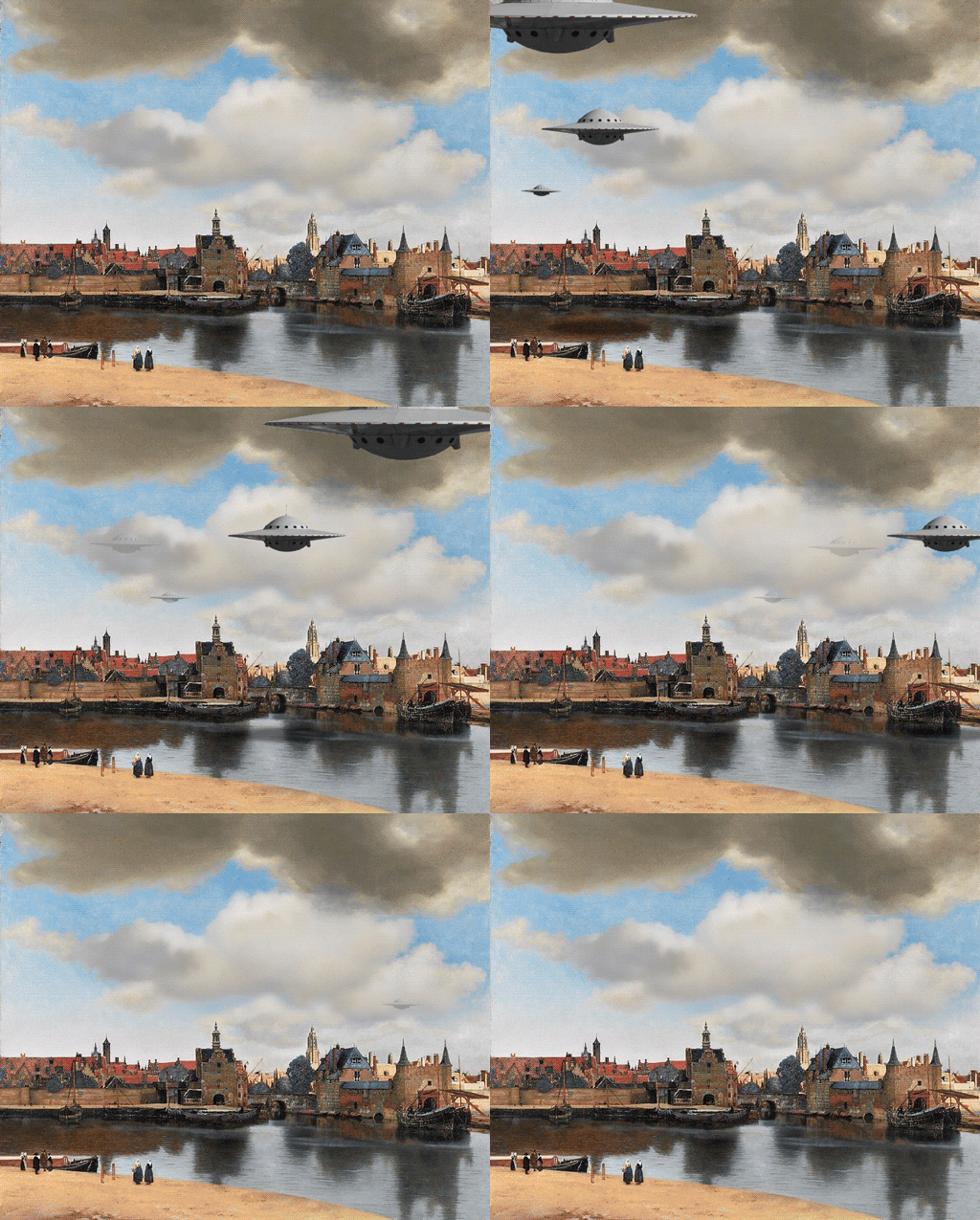
It’s stressful out there; maybe some of you could use a little levity right now. My old colleagues at the Digital Public Library of America, along with our international friends at other expansive digital libraries, including Europeana, Trove, and Digital NZ, are running the fun GIF IT UP competition again this year. Contestants take open access digitized materials from libraries, archives, and museums, and turn them into whimsical GIFs. 

Aliens Delft By GIF – Find & Share on GIPHY

culture, art, cultural heritage, public domain, open culture

This year Japan Search, a relatively new national aggregator of digitized library/museum content, joins in. Here’s the original, gorgeous “Snow at Shinkawabata, Handa, Bishu” by Kawase Hasui (with kudos to the Tokyo Fuji Art Museum for CC0-ing the digital image):

And a clever, peaceful GIF created from that artwork:


The recently launched Atlascope Boston provides a movable window into the past by combining over a hundred old and new highly detailed atlases of the city, allowing you to see change over time:

Back when the New York Public Library had the creative NYPL Labs group, they were building toward something like this with their NYC Space/Time Directory.

And if you can imagine combining this with archival materials and other documents and data, you can see where we are headed with the Boston Research Center.


I’ve been writing Humane Ingenuity long enough that there have been developments on topics from earlier issues of the newsletter.

First, there’s a terrific paper out from the Carnegie Mellon University Libraries on the focus of HI3: AI in the archives. “CAMPI: Computer-Aided Metadata generation for Photo archives Initiative,” by Julia Corrin, Emily Davis, Matt Lincoln, and Scott Weingart, is brilliant and very promising. The approach is similar to the one I speculated about, that a combination of computer vision and human guidance could lead to a vast improvement in how we describe and search through large collections:

The ultimate goal of our prototype was to leverage these new visual similarity capabilities with the existing archival structure and description to rapidly streamline how editors created item-level metadata in the form of content tagging. Editors would select a tag to work on and then identify a starting seed photograph by searching through the existing metadata for a representative picture of, say, “Football players”, then use visual similarity results based on that photograph to identify other photos across the collection that needed the same tag.

The machine-aided clustering of similar photos creates a foundation for quick human-led processing—the best of both worlds.

In HI24, I explored the idea that using lower resolution digital environments might provide—surprisingly—a greater feeling of connection online than verisimilitude. My university adopted this idea with its 8-bit zone for student groups:

Andrew Hadro, brother of HIer Josh Hadro and a saxophonist, kindly recorded a demonstration of the Playasax after it was noted in HI27:

QRS PLAYASAX – Demonstration, explanation, patents and ads! – YouTube

A fun saxophone shaped antique toy from the 1920/30’s. It’s kind of a hybrid harmonica and player-piano shaped like a saxophone. Scroll on through for a demo…

And finally, Brian Foo, 2020 Innovator in Residence at the Library of Congress (see HI10), has made significant progress on his software for inserting public domain sound samples into music tracks: