From time to time administrators ask me what I think the home page of a university website should look like. I tell them it should look like the music site The Sixty One, which simply puts a giant photograph of a musician or band in your face, stretched (or shrunk) to the size of your screen:

Menus are contextual, hidden, and modest; the focus is always on the experience of music. It’s very effective. I am not surprised, however, that university administrators have trouble with this design—what about all of those critical menus and submenus for students, faculty, staff, alumni, parents, visitors, news, views…? Of course, the design idea of a site like The Sixty One is to put engagement before information.
Universities have actually moved slightly in this direction in the past year; many of them now have a one-third slice of the screen devoted to rotating photographs: a scientist swirling blue liquid in a beaker, a string quartet bowing, a circle of students laughing on the grass. (Expect a greater rotational frequency for that classic last image, as it is the most effective anti-MOOC advertising imaginable.) But they still have all of those menus and submenus cluttering up the top and bottom, and news items running down the side, competing for attention. Information before engagement. The same is true for most cultural heritage institutions.
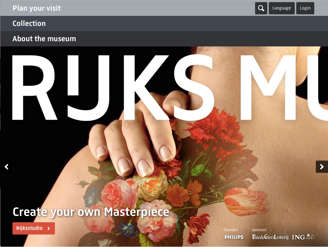
In a break from the normal this fall, the Rijksmuseum went all-in for The Sixty One’s philosophy in their site redesign, which fills the screen with a single image (albeit with a few key links tastefully striped across it):
As effective as it is, engagement-before-information can be an offputting design philosophy for those of us in the scholarly realm. The visual smacks of popularization, as opposed to textually rich, informationally dense designs. Yet we know that engagement can entice us to explore and discover. Home page designs like the Rijksmuseum’s should stimulate further discussion about a more visual mode for scholarly sites.
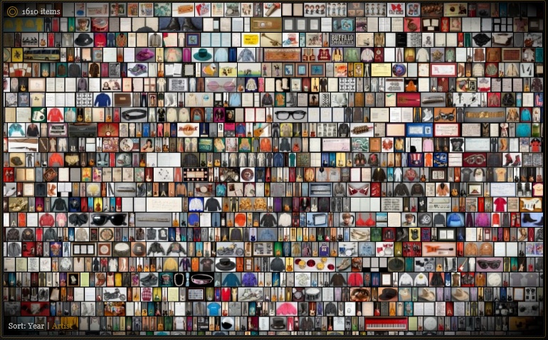
Take the standard online library catalog. (Please.) Most catalogs show textual search results with plenty of metadata but poor scannability. Full-screen visual browsing—especially using the principle of small multiples, or grids of images—can be very effective as a scholarly research aid, facilitating comparison, discovery, and serendipity.
Oddly enough, one of the first examples I know if this design concept for a research collection comes from the Hard Rock Cafe, which launched a site years ago to display thousands items from its memorabilia archive on a single screen. You can zoom in if something catches your eye—a guitar or handwritten lyrics.
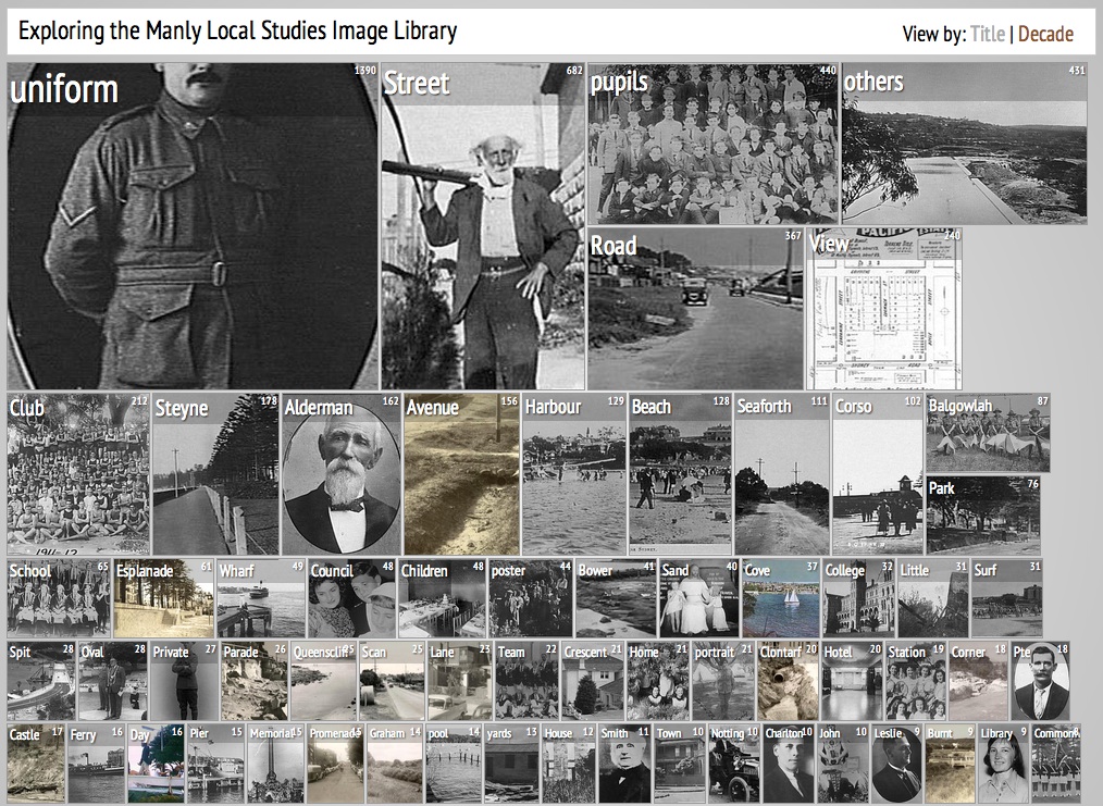
Mitchell Whitelaw of the University of Canberra has been experimenting with similar ideas on his Visible Archive blog. This interface for the Manly Library uses the National Library of Australia’s Trove API to find and display archival documents in a visual-first way:
The images on the search page are categorized by topic (or date) and rotate gently over time without the researcher having to click through ten-items-to-a-page, text-heavy search results. It’s far easier to happen upon items of interest.
Whitelaw has given this model a great name—a “generous interface“:
Collection interfaces dominated by search are stingy, or ungenerous: they don’t provide adequate context, and they demand the user make the first move. By contrast, there seems to be a move towards more open, exploratory and generous ways of presenting collections, building on familiar web conventions and extending them.
I can imagine generous interfaces working extremely well for many other university, library, and museum sites.
Update: Mitchell Whitelaw let me know about another good generous interface he has worked on, Trove Mosaic:
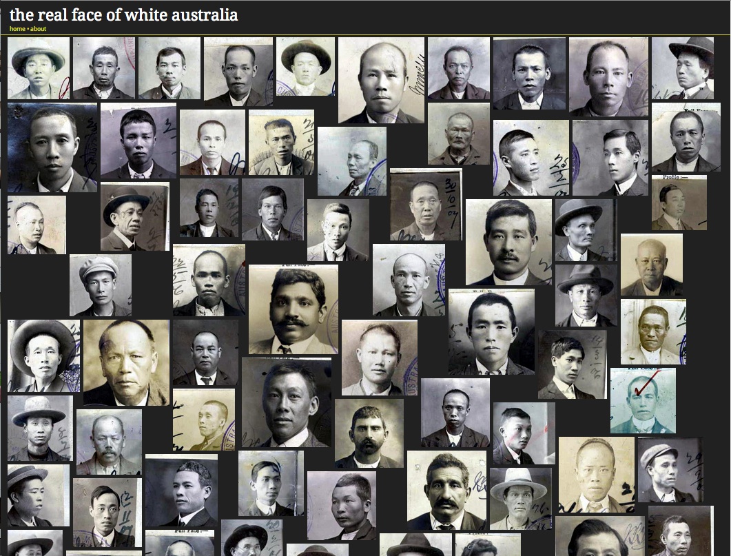
And I should have remembered Tim Sherratt’s “Faces” interface for Invisible Australians:
Trevor Owens connects the generous interface to recent commercial services such as Pinterest. (I would add Flickr’s 2012 redesign.) Thinking about how scholarly generous interfaces are like and unlike these popular websites is important.


Comments
Great post. The design impact of a website/database cannot be overlooked. Functionality and design are equally important.
Those interfaces are really interesting! The idea of presenting collections in this way is very appealing, and I agree it can be appropriate for many scholarly web sites, which are, after all, “collections”.
But I wouldn’t want a university home page to use one of those. Sure, it can be appropriate for a band: I want my favorite artists to have their very own, special, even not-so-usable web presence. But whenever I visit my university web page, I’m probably looking for something specific, and don’t want to play with a new sort of interface. This was very well captured by this web comic. In my own alma matter, many people find things on the university website by using Google…
Even if your hammer is new and shiny, a screw is not a nail…
Great post and definitely inspirational! Thanks for talking about Mitchell Whitelaw’s “generous interface” concept.
Lorcan Dempsey points me to his post on the concept of “glanceable displays,” a related design idea.
Interesting post Dan. I’m currently working on designing generous interfaces for a number of digital humanities projects after being inspired by Mitchell Whitelaw’s work. I definitely think they are an interesting way to potentially increase engagement with a resource by promoting its contents “up front” and also maybe even suggesting exploration paths (although I would need to see more evidence via usability testing and stats analysis etc. before I’d say this was definitively the case). I also think they provide an opportunity to think about how data visualisation techniques can be used in UI design.
On the point of university websites–I’ve also worked on this side of things and I’d say in their defence that their design (particularly home design) and IA is–as with other other large or “corporate” websites–usually a compromise between user need (e.g. I want to be able to access the library catalogue) stakeholder interests (e.g. marketing information) and strategic aims (e.g. we need to recruit more international students). So I can’t see the menus and submenus disappearing any time soon!
I like the idea of the generous interface, but I think university websites are a really bad candidate for applying that principle. While I agree university websites on the whole can and should be more engaging than they are, they need to maintain information before engagement. Consider the websites you’re using as examples: a band site, a museum site, and several image collections. The band really needs to attract new fans and engage with its existing ones — fine. The museum has outreach as one of its primary directives — fine. And naturally this kind of interface can work very well with image collections, where the content itself is visual. But outreach is not the main goal of a university, and the content it needs to present is not strictly visual. The website needs to not just attract new students, but also act as a portal for existing members of the university community to accomplish their day-to-day or occasional tasks. University website users often come looking for information — about the academic calendar, research activities, athletics, collections, and even links to student/staff portals and university resources like the library. That kind of functionality would be severely hindered by hidden menus and a dearth of textual content. You mention that a generous interface promotes exploration and discovery. I agree, but I think that exploration and discovery are not necessarily the primary goals of university website users — a lot of them just want to get their info and get out as fast as possible.
On the topic of library catalogs, you raise a good point about many catalogs not being very easily scannable. However, given that the primary content is textual and not visual (people need titles to pick their books, not just cover images), a list is one of the most scannable formats you can provide. I would argue that formatting improvements to the search results page are a better choice than switching to a grid for increasing scannability. I also think that Hard Rock Cafe site is a good example of the limitations on the visual grid for research. You say you can zoom in on something that catches your eye — but that means you are more likely to miss out on all the things that are not visually appealing enough to catch your eye, but are still vital to your research. If you want to go through your options systematically, a list is way easier to deal with than a close-packed grid of images without any other identifying information.
Hey Dan – thanks for the mention. Just a note to say that both those projects have relocated: Manly Images is at http://mtchl.net/manlyimages and TroveMosaic at http://mtchl.net/trovemosaic.
[…] (Photo courtesy of Dan Cohen, Executive Director of the Digital Public Library of America’s blog post on “Generous …) […]
@S.M.: I agree with your perspective as it pertains to the U sites. I am interested in looking at designs that merge the “generous” paradigm with textual data. HTML 5/CSS might make it easier to do some of this work in a way that scales vis a vis “responsive design” but I agree it’s important to NOT compromise functionality within this context. I’m going to keep my eyes out for examples in the wild…
Here’s a couple more that I made last year for you, Dan:
http://twoway.st – an internal R&D project we made with the British Museum catalogue, and
http://alpha.wellcomelibrary.org – a catalogue explorer made with the Wellcome Library.
(Hi.)
[…] (Photo courtesy of Dan Cohen, Executive Director of the Digital Public Library of America’s blog post on “Generous …) […]
[…] Dan Cohen, “Generous Interfaces for Scholarly Sites,” Dan Cohen website, 5 December 201… […]